What is Responsive Design ?
Responsive design refers to the creation of digital interfaces, such as mobile apps and websites, that adapt their design as the interface changes size or orientation with the purpose of ensuring usability.

Responsive design refers to the creation of digital interfaces, such as mobile apps and websites, that adapt their design as the interface changes size or orientation with the purpose of ensuring usability.
SubscribeIn order to meet accessibility requirements required by law, also known as ADA Compliance, companies of certain sizes must meet the World Wide Web Consortium (W3C)'s Web Content Accessibility Guidelines (WCAG).
Although these guidelines are designed for the web, there is consensus in the industry that they are the standard for mobile apps.
As part of these guidelines, companies must ensure that the interface is usable across all devices and orientations.
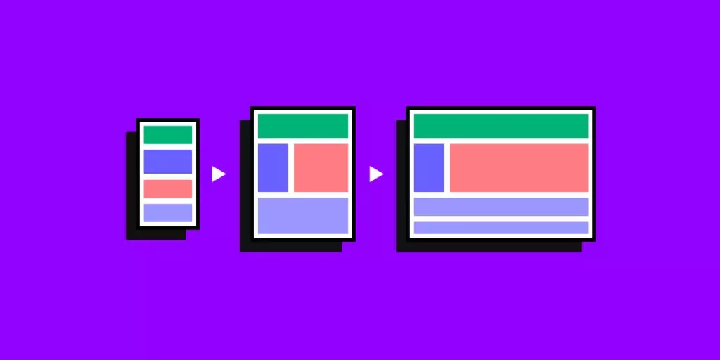
To achieve this, designers employ Responsive Design which uses a series of Layouts to guarantee that the elements not only look good but are also fully functional.
The number of layouts that a website or app uses often comes down to the number of Breakpoints that a designer chooses to implement, along with a number of variations depending on the orientation of a device at a breakpoint.
For example, you could have a website with three breakpoints (mobile, tablet and desktop) and 5 layouts (mobile portrait, mobile landscape, tablet portrait, tablet landscape, other).
What is a Layout ?
A layout is an arrangement of visual elements, such as text, images, shapes or buttons, on printed media, a website page or an app screen.
Responsive design often uses an auto layout (i.e. constrained based layout) to make sure that the interface responds correctly to changes in size or orientation.
What are Breakpoints?
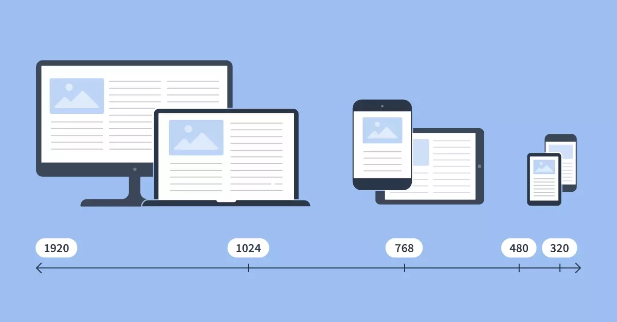
A range of points that determine when a website or app should change layout.
What recommendations do you have for creating responsive user interfaces ?
We recommend that you employ auto-layout and constraints to achieve desired results.