What is a Flex Box?
A flex box, or Flexible Layout, is a World Wide Web Consortium (W3C) specification that describes a box model optimized for user interface design.
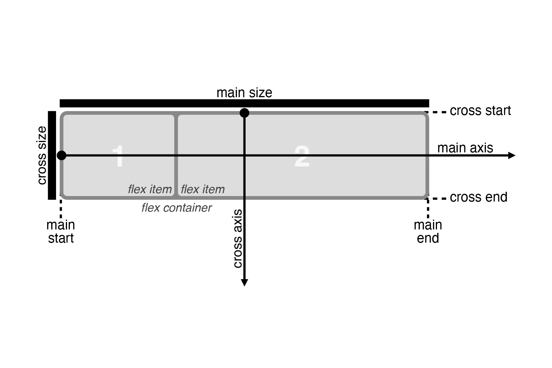
In the flex layout model, the children of a flex container can be laid out in any direction, and can “flex” their sizes, either growing to fill unused space or shrinking to avoid overflowing the parent.

Flex layout is superficially similar to block layout. It lacks many of the more complex text- or document-centric properties that can be used in block layout, such as floats and columns. In return it gains simple and powerful tools for distributing space and aligning content in ways that web apps and complex web pages often need.

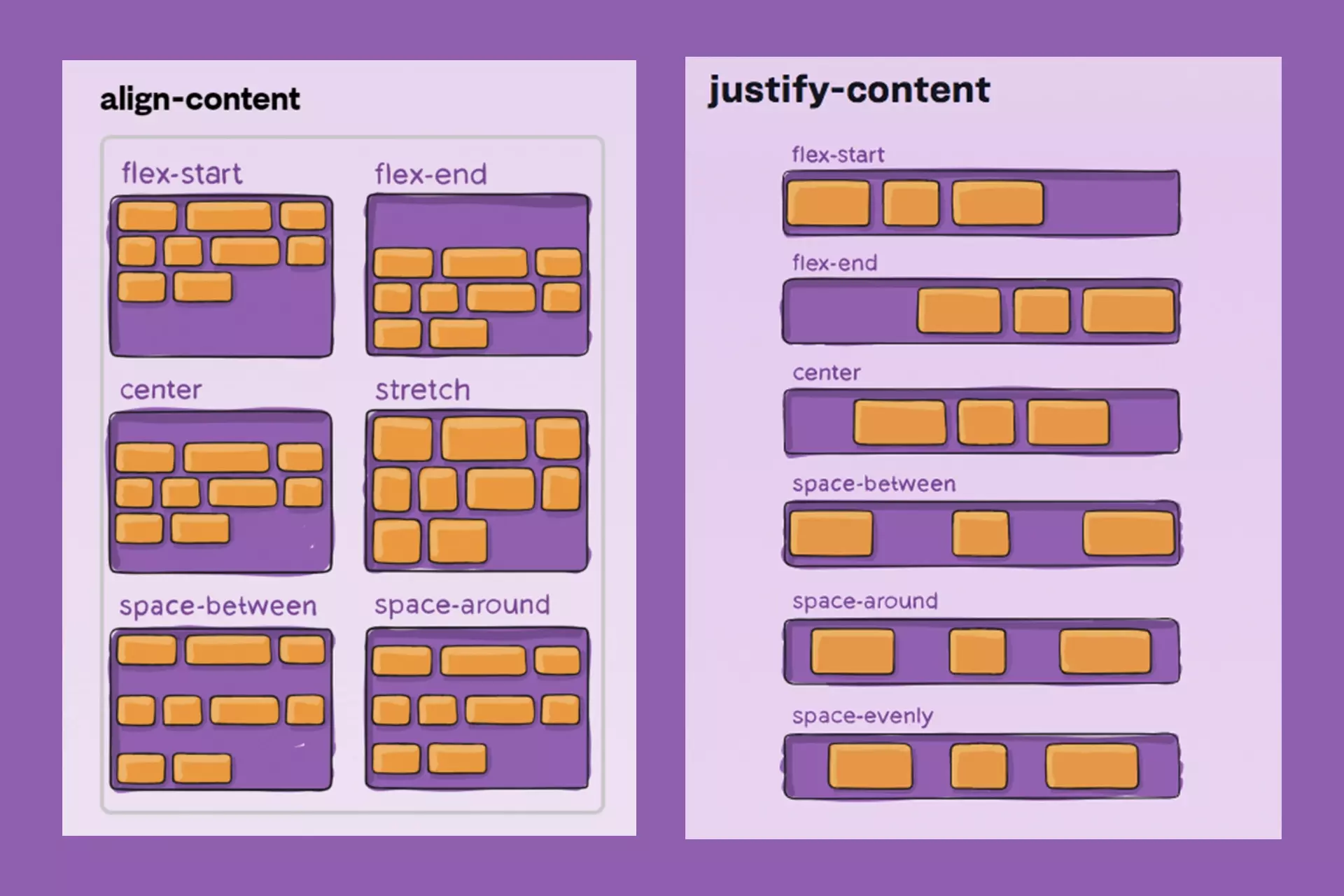
An illustration showing how content can be laid out using the align-content and justify-content css properties.
The contents of a flex container:
- can be laid out in any flow direction (leftwards, rightwards, downwards, or even upwards!)
- can have their display order reversed or rearranged at the style layer (i.e., visual order can be independent of source and speech order)
- can be laid out linearly along a single (main) axis or wrapped into multiple lines along a secondary (cross) axis
- can “flex” their sizes to respond to the available space
- can be aligned with respect to their container or each other on the secondary (cross)
- can be dynamically collapsed or uncollapsed along the main axis while preserving the container’s cross size
"The specification describes a CSS box model optimized for user interface design. In the flex layout model, the children of a flex container can be laid out in any direction, and can “flex” their sizes, either growing to fill unused space or shrinking to avoid overflowing the parent. Both horizontal and vertical alignment of the children can be easily manipulated. Nesting of these boxes (horizontal inside vertical, or vertical inside horizontal) can be used to build layouts in two dimensions.
CSS is a language for describing the rendering of structured documents (such as HTML and XML) on screen, on paper, etc."
- W3C