What is a Breakpoint?
A range of points that determine when a website or app should change layout.

Written by Oscar de la Hera Gomez
First published on 07/29/2023 at 15:57
Last Updated on 07/29/2023 at 16:20
A range of points that determine when a website or app should change layout.
Subscribe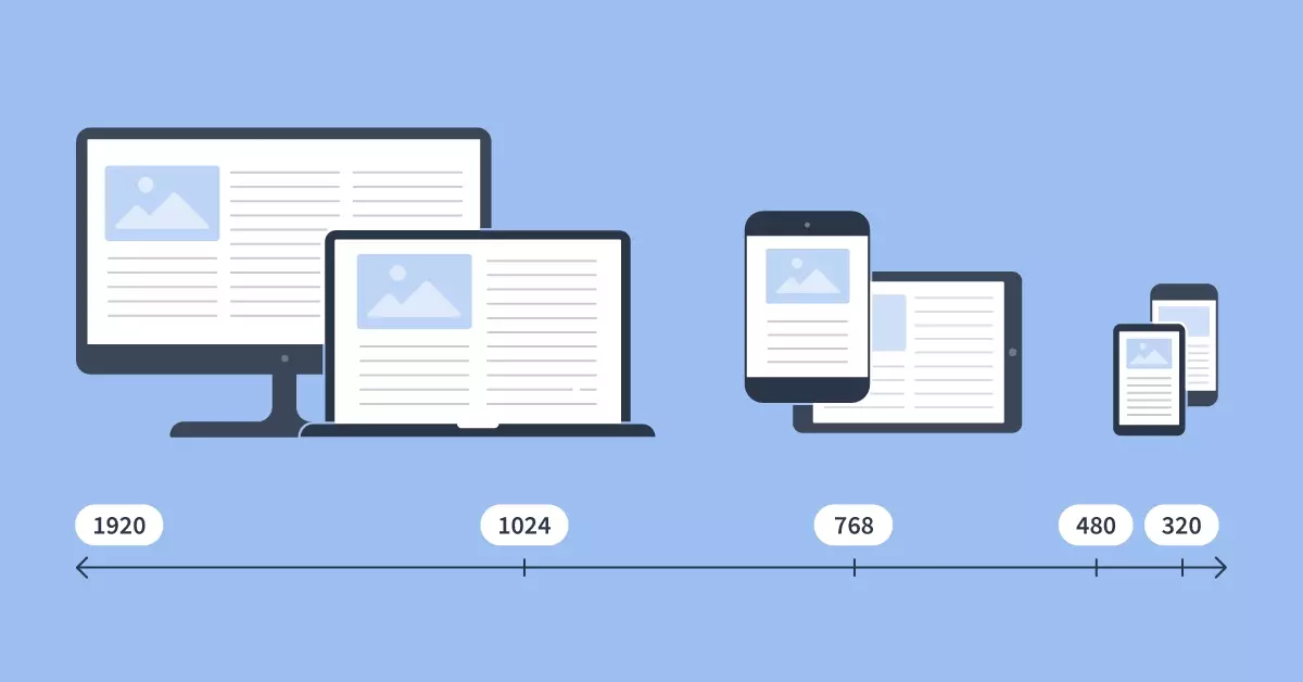
These points are often defined in number of pixels and target changes in the width of the screen or browser, to offer a responsive user interface design that uses multiple layouts.
For example:
- Breakpoint 0: Screen or Browser width is less than 400px.
- Breakpoint 1: Screen or Browser width is less than 768px.
- Breakpoint 2: Screen or Browser width is less than 1024px.
- Breakpoint 3: Screen or Browser width is less than 1440px.
- Breakpoint 4: Screen or Browser width is less than 1920px.
Any Questions?
We are actively looking for feedback on how to improve this resource. Please send us a note to inquiries@delasign.com with any thoughts or feedback you may have.
SubscribeContact UsVisit our BlogView our ServicesView our Work