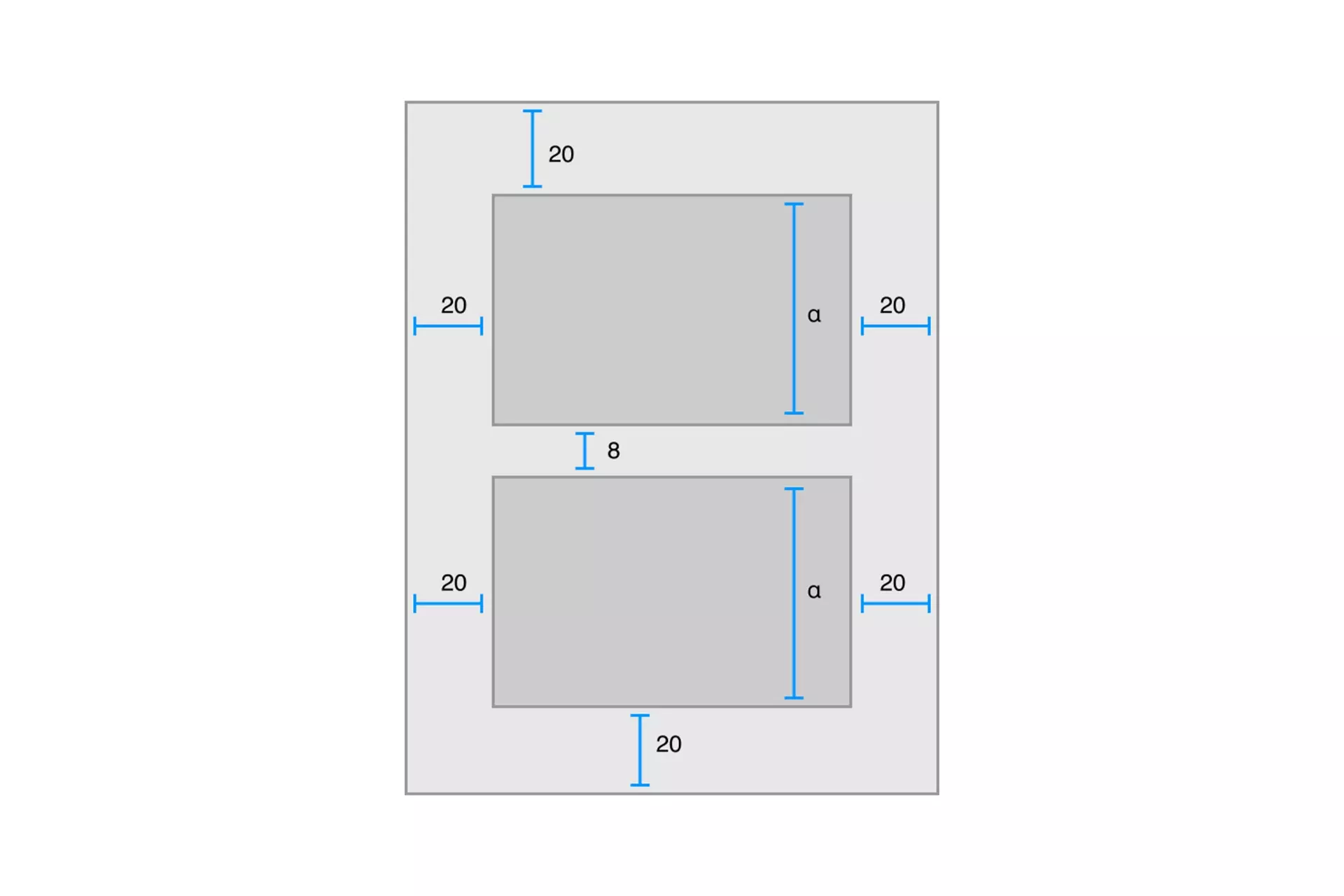
What are Digital Interface Constraints?
Constraints refers to the relationship between two user interface objects. They allow you to position a UI element in a specific place relative to a screen or another UI element.

Constraints refers to the relationship between two user interface objects. They allow you to position a UI element in a specific place relative to a screen or another UI element.
SubscribeReferred to as an NSLayoutConstraint by Apple and a LayoutConstraint by Android; Constraints allow you to create responsive layouts in which UI elements are positioned in relative space, to either the screen or other UI elements

Apple's example of a constrained layout
Examples of constraints include:
- The menu button is found on the bottom left of the screen, 20px from both the bottom and the left.
- The title is centered horizontally on the screen and has a maximum width of 200px.
- The subtitle is centered horizontally on the screen and is 20 px below the title.
- An image is centered vertically and horizontally on the screen and fills 25% of the width and height of the screen.
- A video is found on the bottom right of the screen, 100px from the bottom and 20px from the right. The width of the video matches the width of the title and the height matches the width of the title at a 16:9 ratio.
It is important to note that constraints can change as a screen adapts its size or orientation.
This can be referred to as using multiple auto-layouts within a responsive design.