User Experience Map What it is & How to create one
A user experience map gives a holistic understanding of your mobile or desktop application.
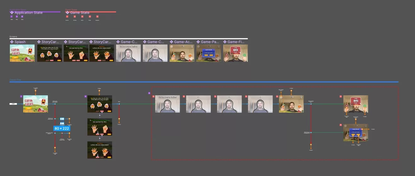
A user experience map gives a holistic understanding of your mobile or desktop application by laying out all your screens in a logical order that have application/experience states or sub states associated to them & which answers all navigation questions pertaining to the experience.
SubscribeThe following guide walks you through the user experience map that we built in Figma for Farm Tales - a mixed reality game of whack-a-mole that is currently available on the Apple App Store.
How do I create a User Experience Map?

To create a user experience map, you must:
- Design & layout all your screens.
- Assign states or sub states to your screens.
- Ask and answer all the navigation questions that could arise and how your application changes in relation to these questions.
What are the key elements of a user experience map ?
The key elements of a user experience map consist of all your screens, states as well as navigation elements that answer questions.
Application/Experience states and sub states.

These are verbal elements, often indicated by a letter or a few characters that refer to a specific screen within an application and help an organization or team understand how an application flows from end to end.
In the case of Farm Tales, we had 3 states:
- Initial state
- Story state
- Game state

Sub states are states within an application or experience state that help an organization or team identify how the experience changes across time. In the case of Farm Tales, we had Game sub states that altered the user interface as the user moved through the experience. These substates were:
- Inactive
- Starting
- Active
- Pause
- Complete
An example of how this helped our development team is, if the Application was in the Game State and the application went into the background:
- If the application was in the Inactive, Starting or Complete state - the application would reset to the Initial state.
- If the application was in the Active state, it would move to the Pause state.
- If the application was in the Pause state it would do nothing.
Subsequently, our Animoji game would alter depending on what the game state was to ensure a cohesive game experience.
A start block.
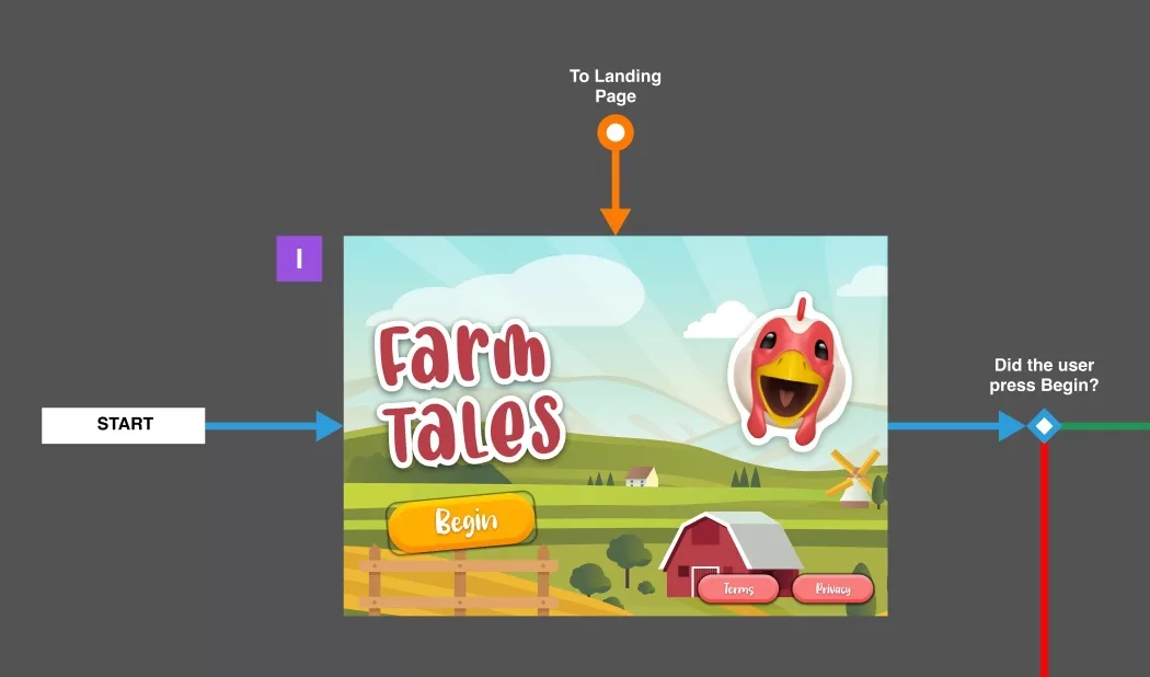
This informs anyone reading the map where the application starts when it is launched and what state and screen it leads to.
In the case of Farm Tales it leads to the Initial State and the Landing Screen.
Automatic advancement arrow
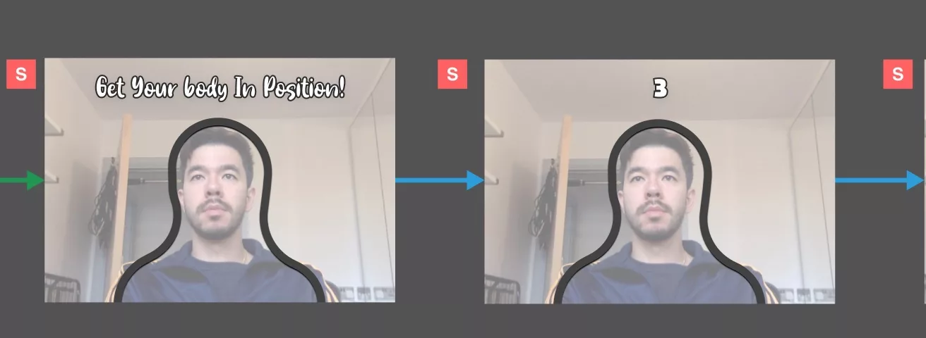
This arrow denotes an automatic advancement and either tells the story of how a state unfolds - like the Starting Game sub state in Farm Tales - or leads to a question that must be answered, which if all negative, returns to the same screen that it started in.
A diamond for questions.
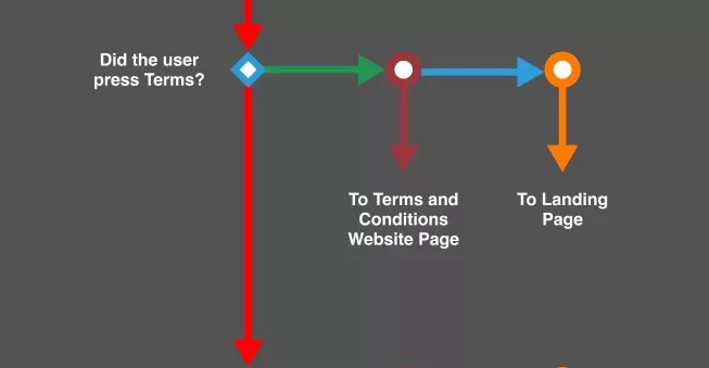
This diamond lets us ask questions like Did the user press begin? or Did the game end? allowing us to know how an experience moves in response to user input.
An arrow for positive answers (YES).
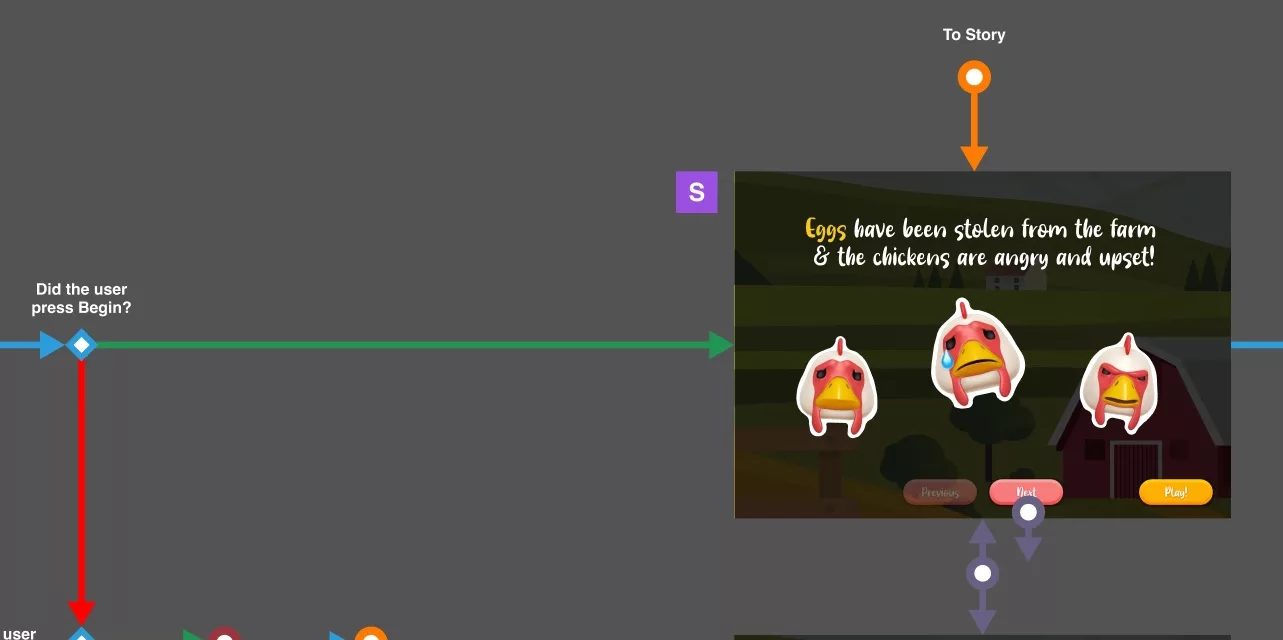
These arrows are used to confirm that an action took place along with how the state changes and to which screen it transitions to.
For example, in Farm Tales, if a user presses the Begin button, the experience changes to the Story state and animates to the Story Carousel.
An arrow for negative answers (NO).
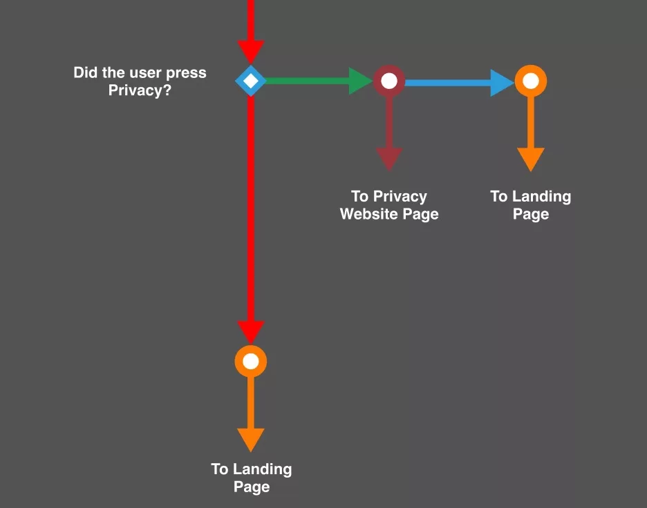
These arrows are used to confirm that an action did not take place and often lead to the next question, or if all negative, back to the screen from which the questions began.
An arrow for direct links to screens.
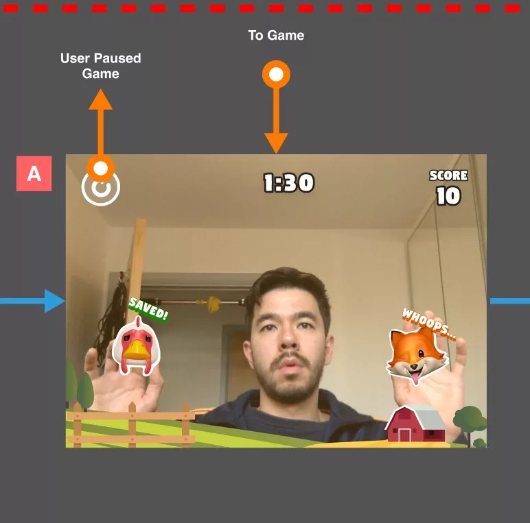
These arrows allow you to connect questions or transitions to screens that may or may not be in close proximity and are useful as the experience grows to avoid having to redraw connections between screens.
An example of this in Farm Tales is that if the game ends, we must transition to the Initial State and the Landing Screen.
A double sided arrow to symbolize scrolling through a carousel.
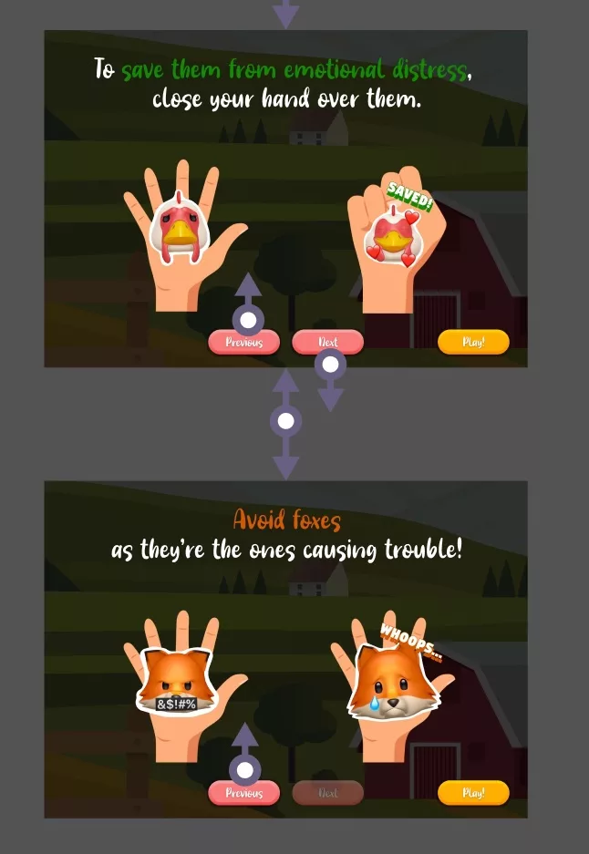
This double sided arrow helps tell the order of your carousel, if there is any, along with how the carousel alters component states (i.e. the button is disabled). We also use arrows of the same color to show how navigation alters the screens.
An example of this in Farm Tales is the order of the Story Carousel and how that alters the button look and if they are available, additionally if a user presses next or previous, it will execute a scroll. If the Story Carousel is in the first slide, the Previous button is disabled and if its in the last slide, the Next button is disabled.
An arrow for external links
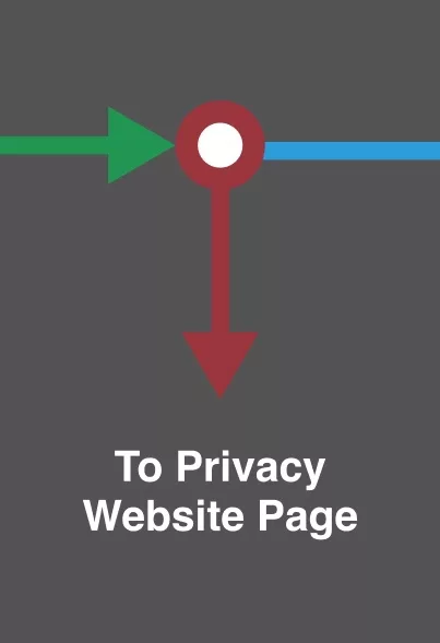
This arrow is used to tell us what webpage or application the app links to in the event of an action.
An example of this in Farm Tales is if a user presses Terms or Privacy.
What is our suggested color scheme for elements?
States
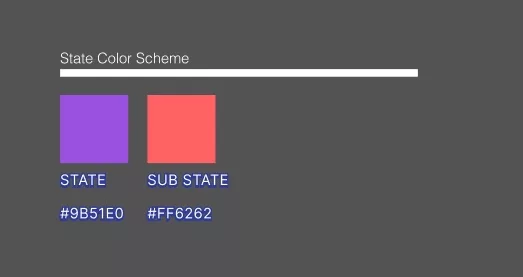
- Application or Experience States: #9B51E0
- Sub States: #FF6262
Elements
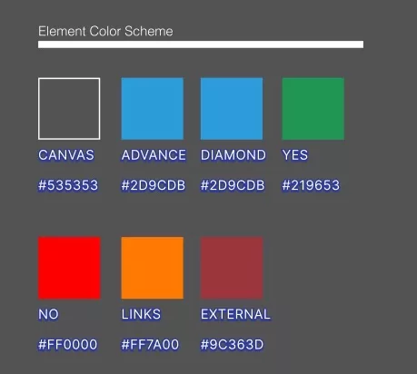
- Canvas background color: #535353
- Arrows that refer to automatic advancement: #2D9CDB
- Diamonds (questions): #2D9CDB
- Arrows that refer to positive answers to questions (YES): #219653
- Arrows that refer to negative answers to questions (NO): #FF0000
- Direct links to screens: #FF7A00
- Arrows that refer to opening a webpage outside your application: #9C363D
Any Questions
We are actively looking for feedback on how to improve this resource. Please send us a note to inquiries@delasign.com with any thoughts or feedback you may have.