How to create responsive type using Tailwind CSS in a NextJS project
In your tailwind.config file, under the extend property, add font-sizes that use clamped values.

In your tailwind.config file, under the extend property, add font-sizes that use clamped values.
SubscribeThis article was made possible by Pelayo Trives Pozuelo.
Please note the following solution only works for dynamic font-sizes and does not yet work for dynamic font-weights or line-heights.
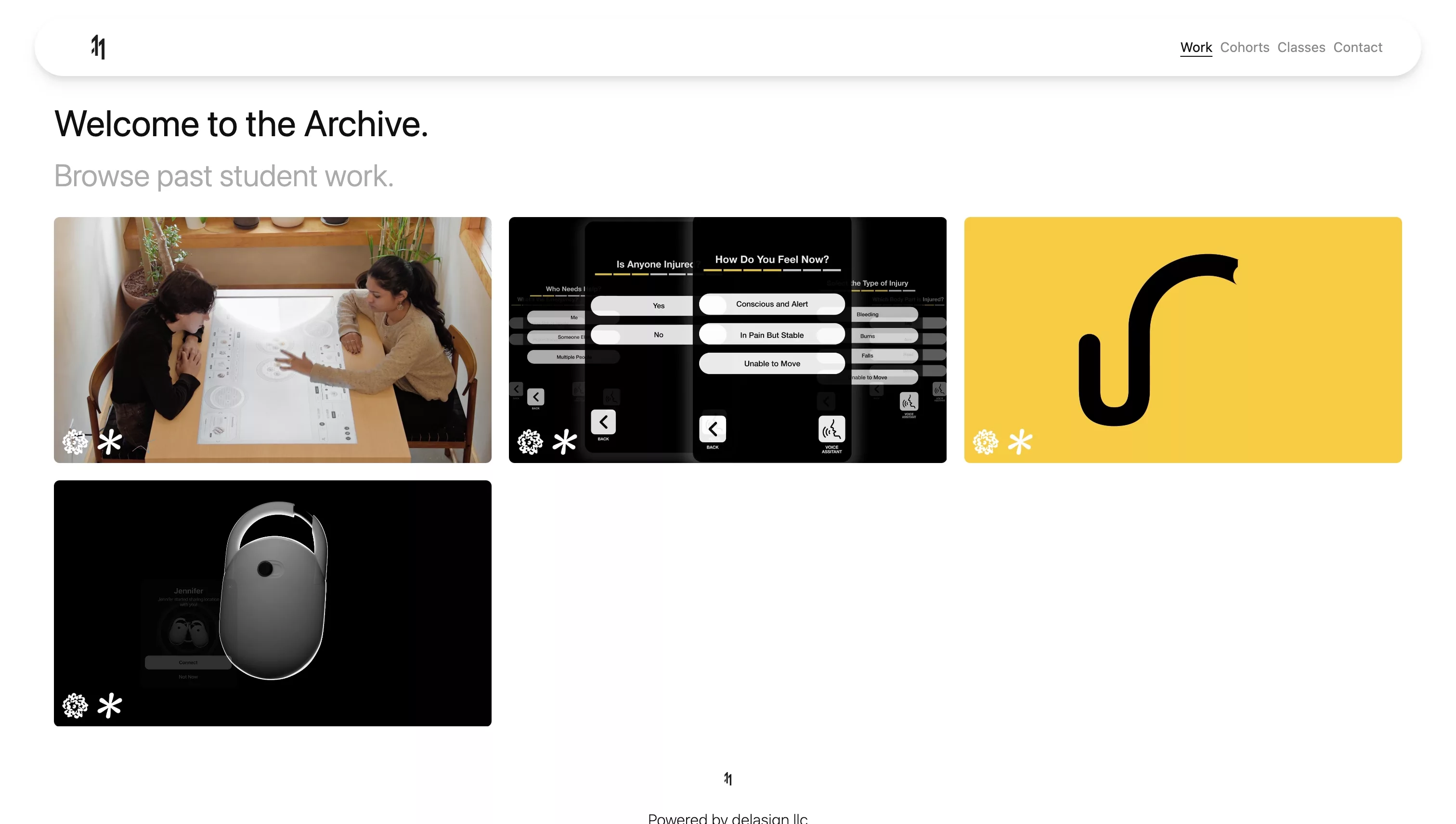
A working example of this tutorial can be found on the archive that exhibits my students work.
Step One: Determine the CSS
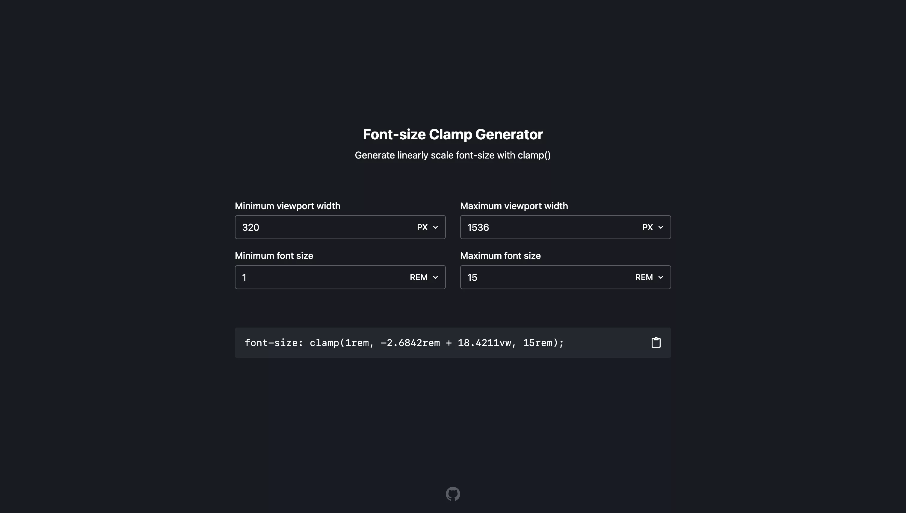
Responsive font-sizes are achieved using the clamp css parameter which allows you to scale a font-size between a minimum and maximum value that scales as the view width of a screen changes.
To simplify this calculation Pelayo Trives Pozuelo made us aware of the Clamp Font-Size Generator website which calculates it for you.
Please note that the minimum viewport width and maximum viewport width must be considered as:
- Don't become smaller below this value (minimum viewport width).
- Don't become larger after this value (maximum viewport width).
Step Two: Add to Tailwind Config
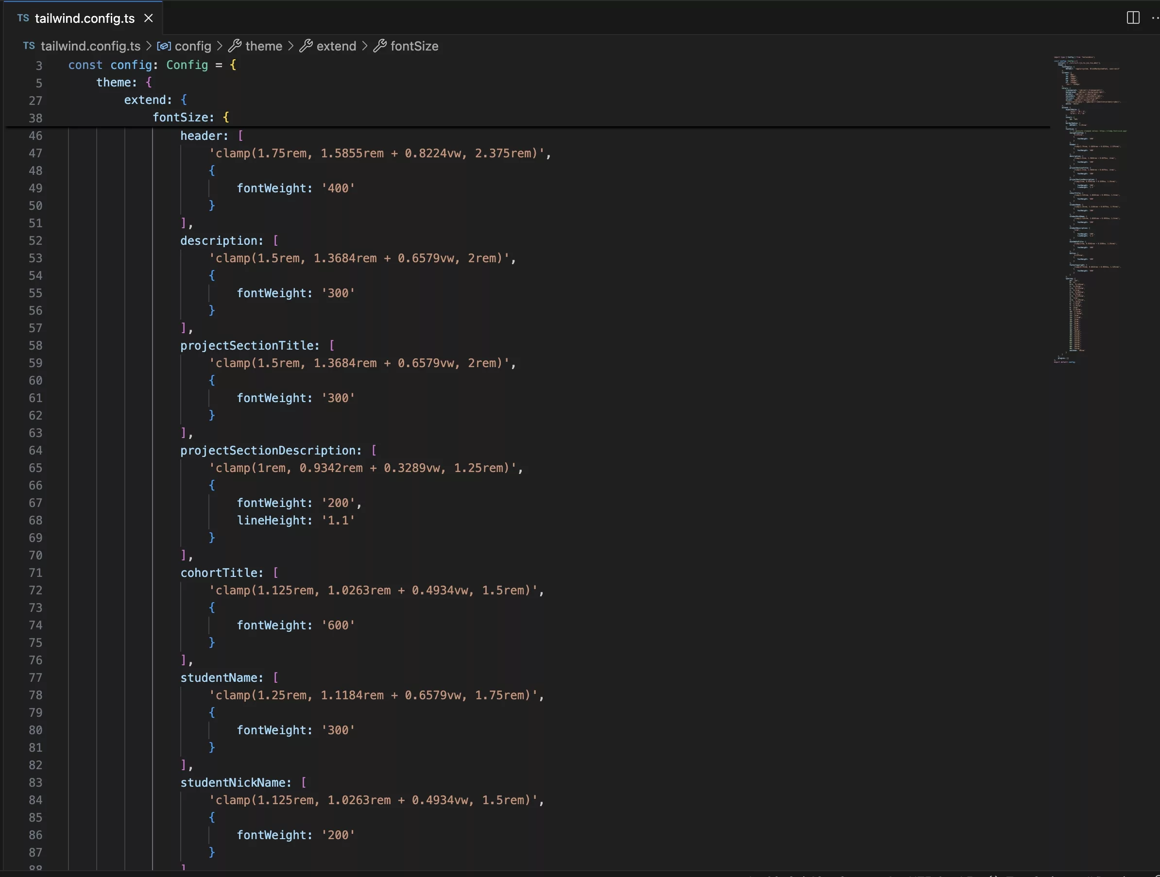
Under the extend property of the tailwind.config, create a font-size for each responsive font-size and paste in the value calculated in Step One.
Step Three: Apply
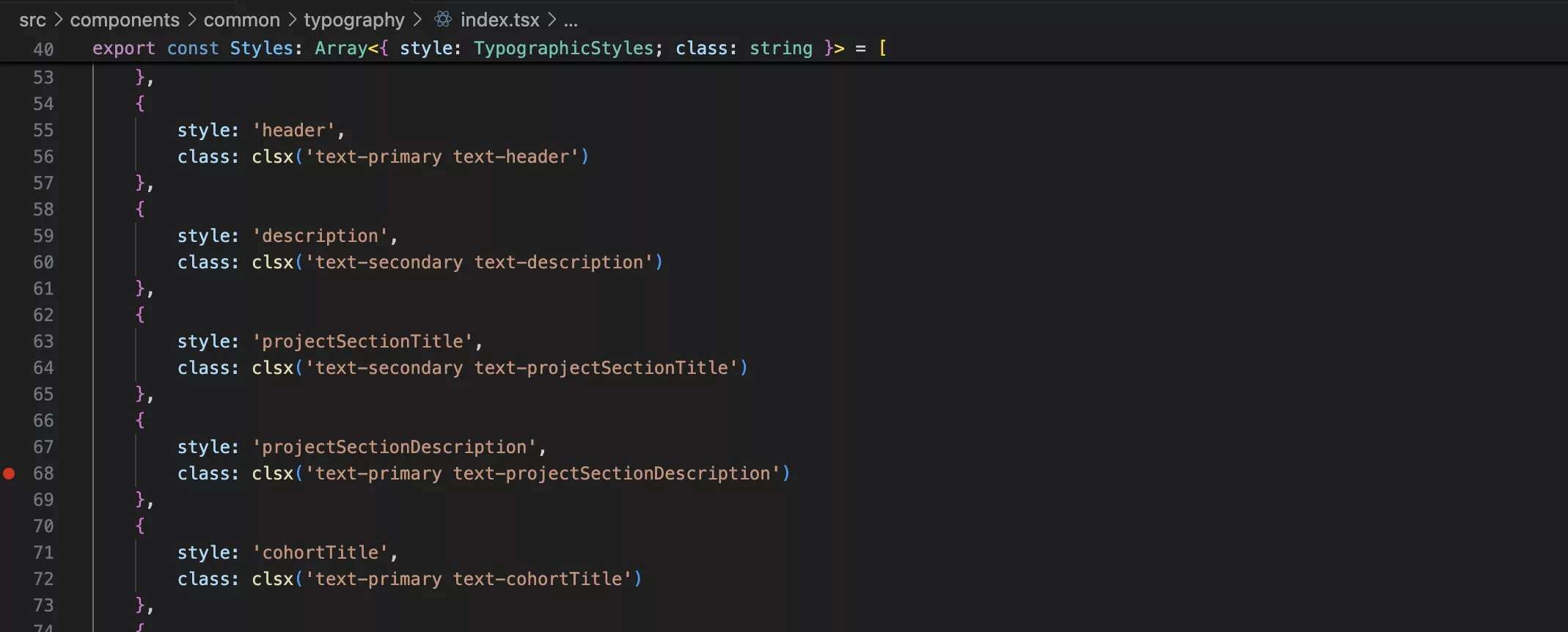
In the NextJS project, apply the typographic style as would with any other text style (i.e. text-...).
Step Four: Test
Run the project locally and scale the webpage to confirm that the type scales as expected.
For a working example visit the archive that exhibits my students work.