How to create Screens that use Responsive Layouts in Figma
A step by step guide on designing responsive screens that change layout as the width of a frame changes in Figma.

A step by step guide on designing responsive screens that change layout as the width of a frame changes in Figma.
SubscribeCheck out our Responsive Design Figma GuidePlease note that design systems such as the one laid out in this article are only available on education, professional or organization Figma accounts.
Step One: Create a Responsive Screen with a Variable Driven Design System
Follow the tutorial below to create a design system and a responsive screen.
Step Two: Create the Responsive layouts
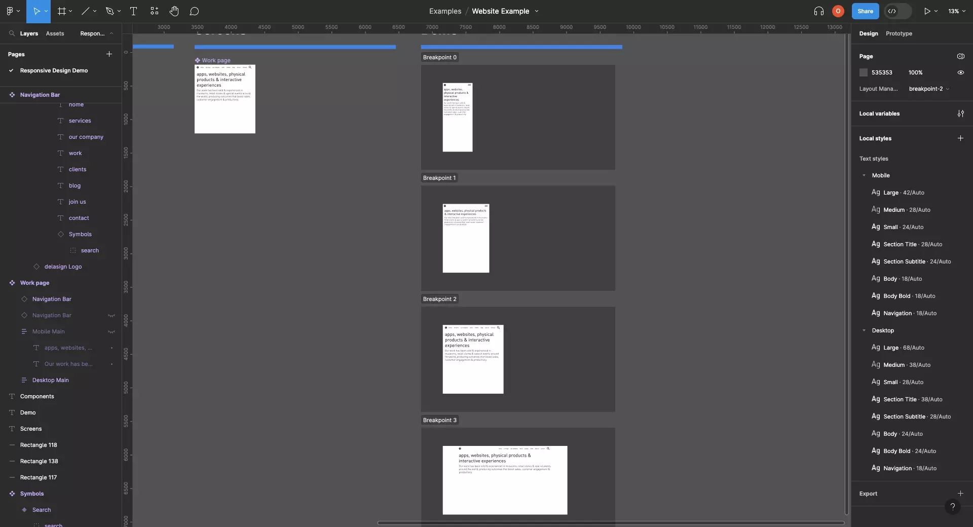
Create as many layouts as required to fulfill the visuals of your digital product.
Apply the relevant typographic style to each layout (i.e. mobile styles -> mobile layouts, desktop styles -> Desktop layouts).
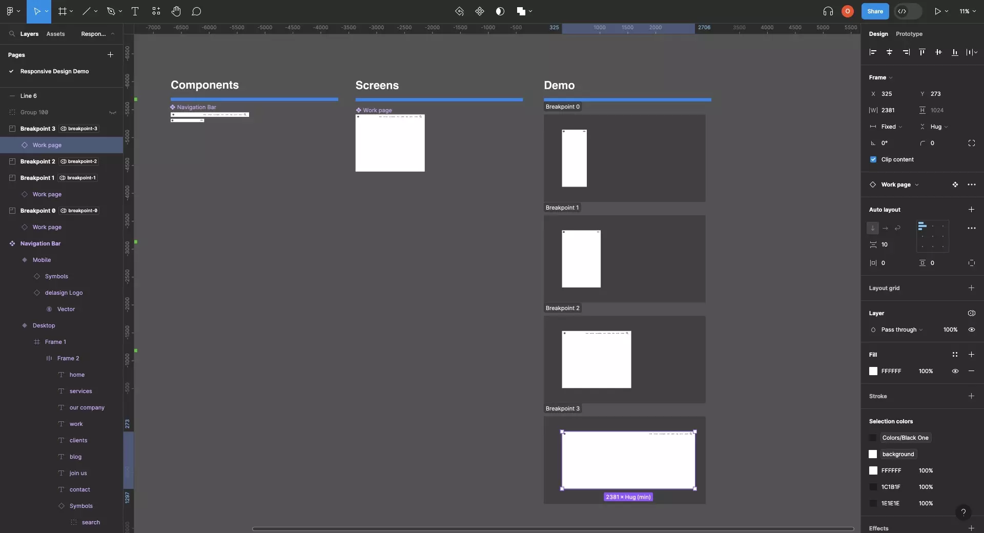
In the case of above, we have two layouts:
- Mobile Layout: A Navigation Bar and a Mobile Main.
- Desktop Layout: A Navigation Bar and a Desktop Main.
Please note that the term "main" refers to the html landmark which is suggested by W3C.
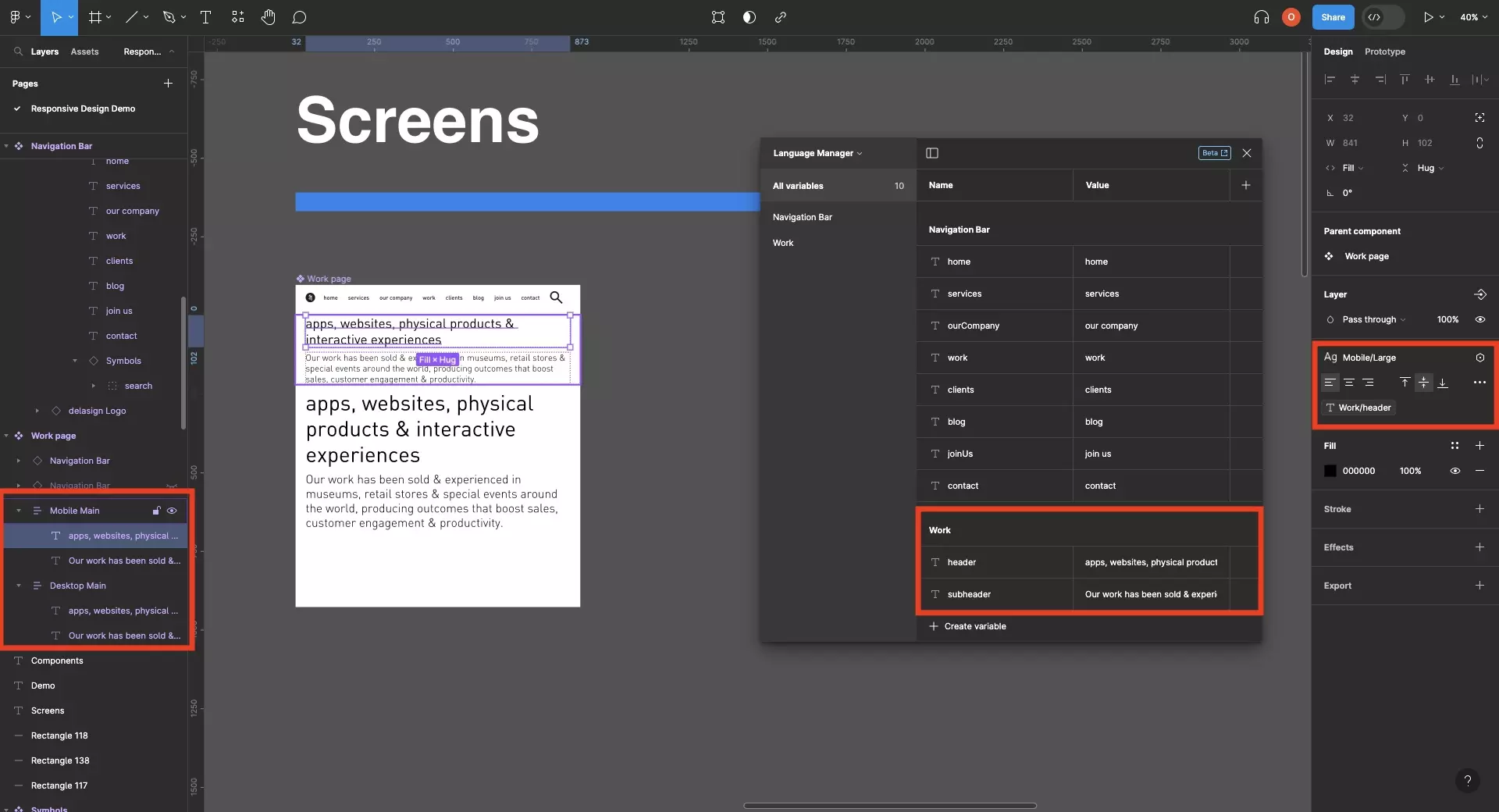
Step Three: Set the Variable Visibility
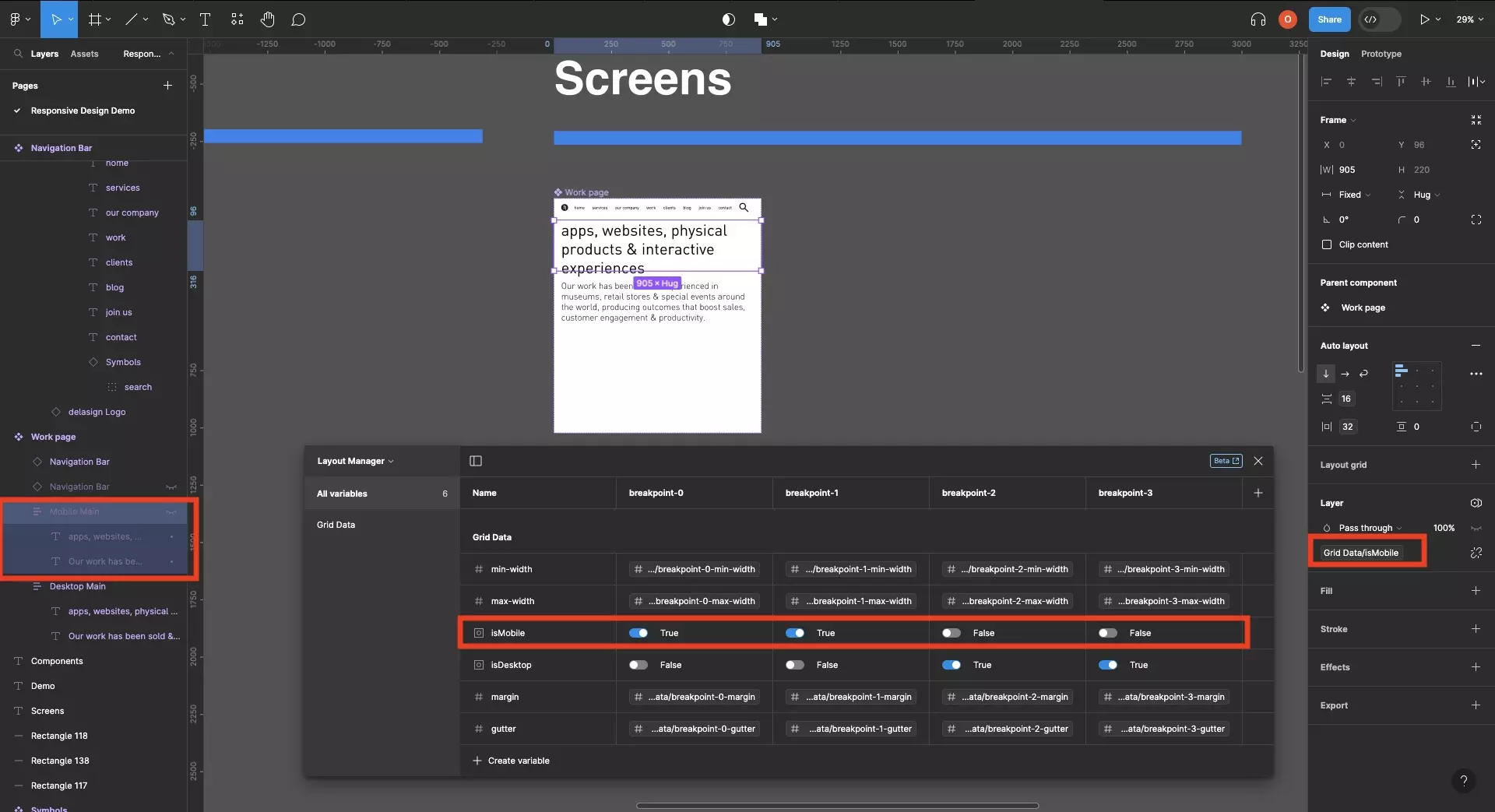
Set the visibility of each layout to match a boolean variable from the layout manager (i.e. isMobile, isTablet, isDesktop).
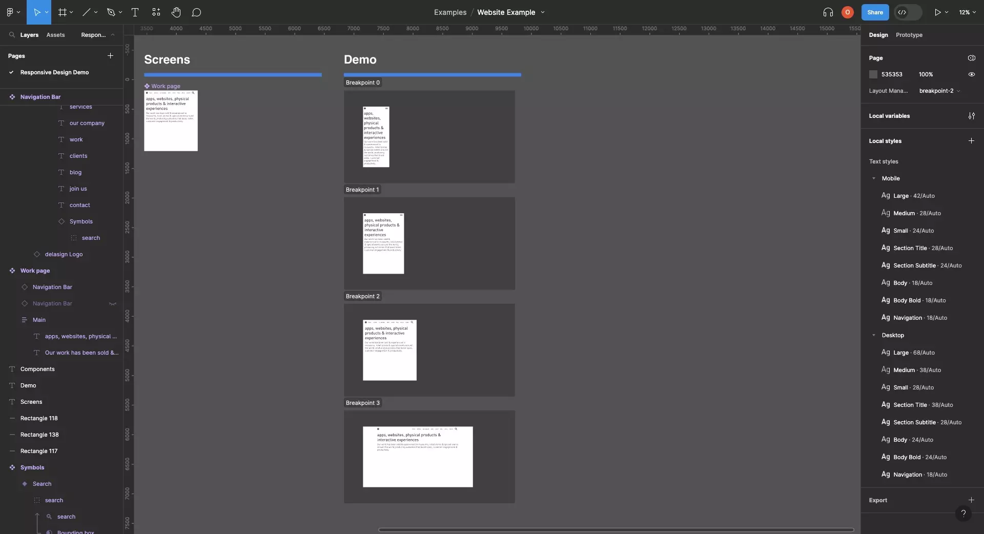
Step Four: Preview
Create sections for each breakpoint of your design and add the component to each section.
Set the breakpoint of each section to the relevant breakpoint you'd like to preview.
Frequently Asked Questions (FAQ)
How can I apply white space on the sides (i.e. margin auto) after a certain width ?
To learn how to use margin-auto, follow the tutorial below.
Looking to learn more about Figma and Responsive Design ?
We recommend you check out our Responsive Design Figma Guide or search our blog to find educational content on learning how to use Figma.