How to create a Responsive Grid in Figma
A step by step guide on designing responsive grids that change the number of grid items that are displayed as the width of a frame changes.

A step by step guide on designing responsive grids that change the number of grid items that are displayed as the width of a frame changes.
SubscribeCheck out our Responsive Design Figma GuidePlease note that design systems such as the one laid out in this article are only available on education, professional or organization Figma accounts.
Step One: Create the Grid Item Component
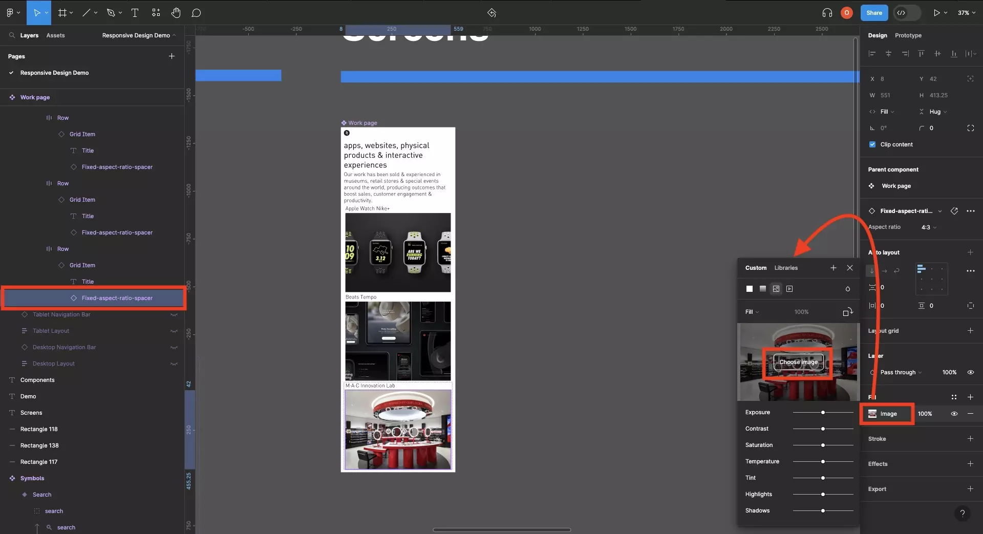
Create a component, and any necessary variants, for the item that will used in the grid.
If you are looking to use images or videos that maintain an aspect ratio, consult the tutorial below.
We also recommend that you consult our responsive typography tutorial to learn how we adapted the components to use text that changes as the screen scales.
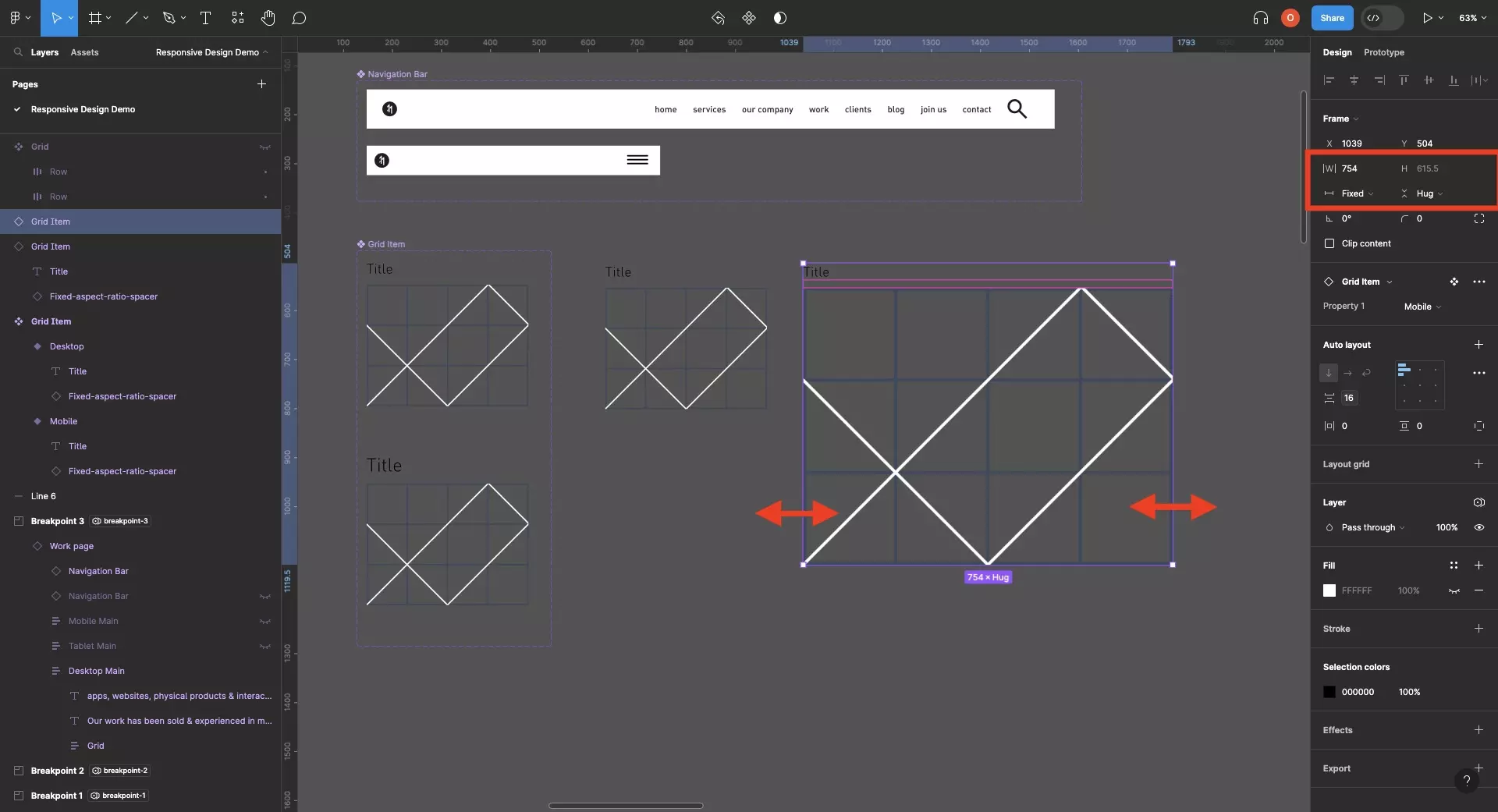
Step Two: Create the Grid Component
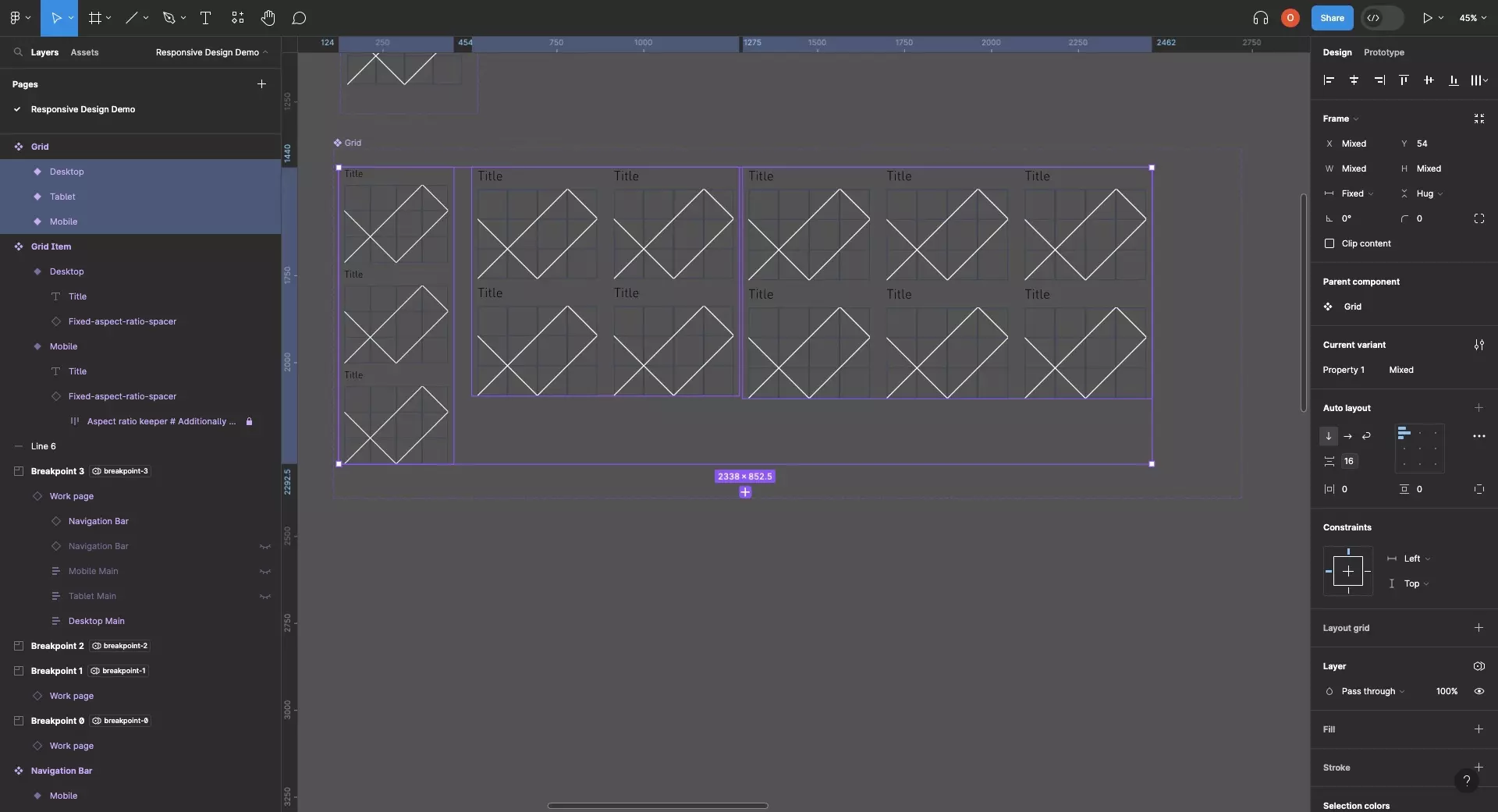
Create a component, and any necessary variants, for the grid.
In the case of delasign.com, we created a grid for mobile, tablet and landscape that varies the amount of grid items that are available in each row (i.e. mobile, 1 item per row; tablet, 2 items per row; desktop 3 items per row).
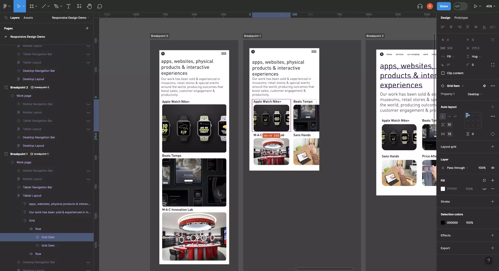
Step Three: Create the Responsive Layouts
Follow the tutorial below to learn how to create responsive layouts.
In each layout, make sure that the grid's horizontal resizing is set to Fill and the vertical resizing is set to Hug.
Step Four: Apply the Content
Apply all relevant copy and assets to your grid.
We recommend using variables for all text values to allow you to localize designs in the future.
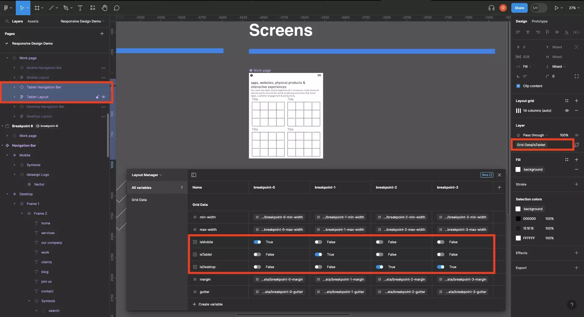
Step Five: Preview
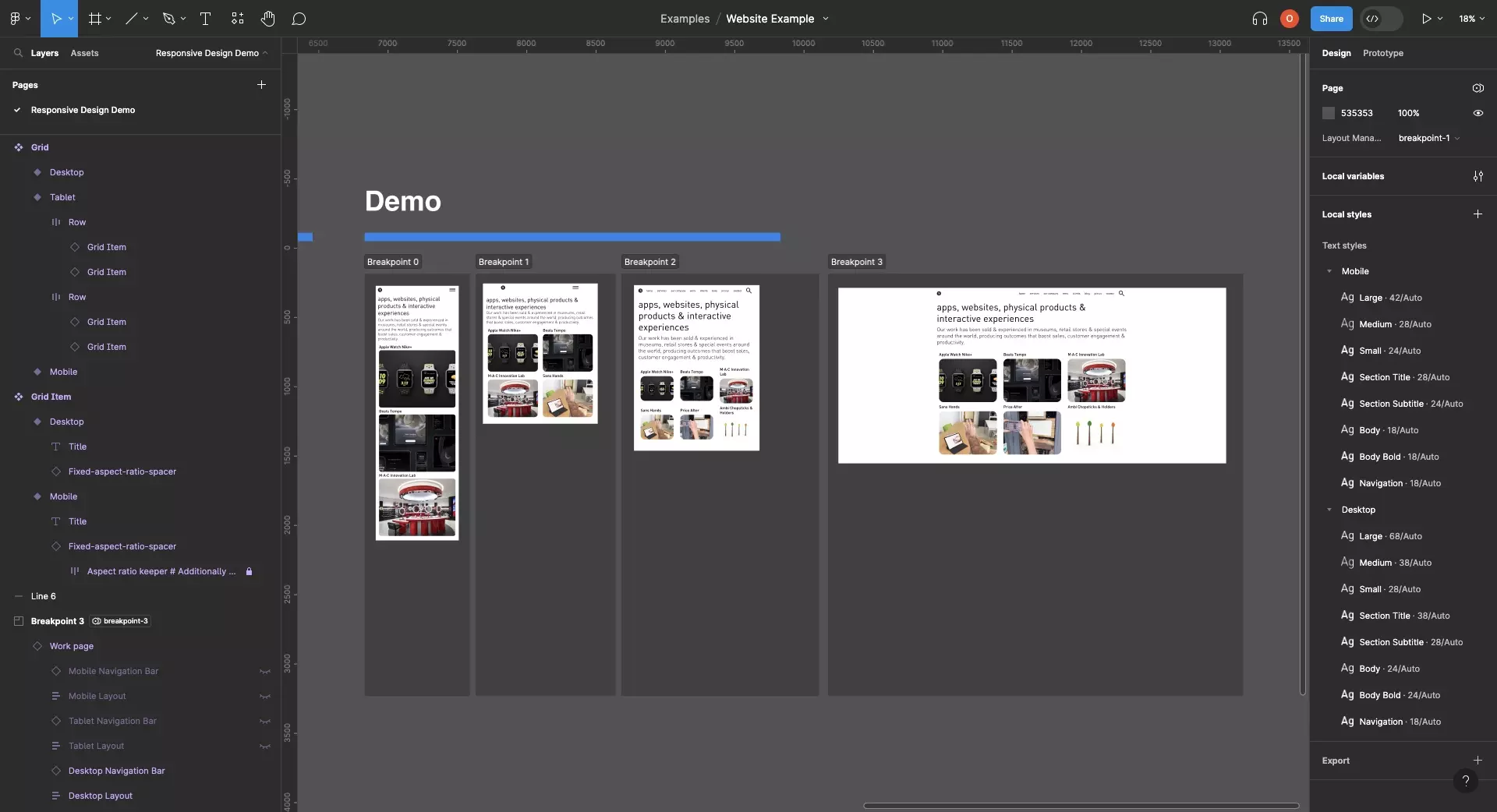
Create sections for each breakpoint of your design and add the component to each section.
Set the breakpoint of each section to the relevant breakpoint you'd like to preview.
Frequently Asked Questions (FAQ)
Why does my grid not resize correctly?
Make sure that:
- Each grid item does not have a minimum width that is breaking the design. We suggest removing it unless you need it.
- The grid that is used within each layout has a horizontal resizing set to fill.
Looking to learn more about Figma and Responsive Design ?
We recommend you check out our Responsive Design Figma Guide or search our blog to find educational content on learning how to use Figma.