How to create a Design that uses Margin Auto after a Max Width

Oscar de la Hera Gomez
A flower that represents Figma with the text "Margin Auto at Maximum Width" beneath it.

A Figma guide on creating a responsive screen that after a maximum width, centers the designs on the screen and applies white space on the sides.

Please note that design systems such as the one laid out in this article are only available on education, professional or organization Figma accounts.

Step One: Configure the Frame

A screenshot of Figma with a frame that uses auto-layout selected. On the right menu side bar, under Auto Layout, we have highlighted that we have set the alignment property to align top center.

Set the frame to use auto layout with a vertical layout and align its content to top and center.

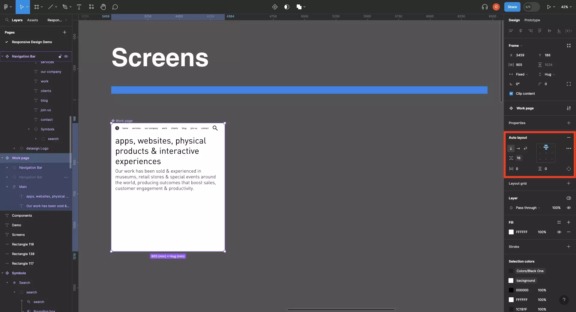
Step Two: Apply the Maximum Width

A screenshot of Figma with the UI elements of a frame that uses auto-layout selected. On the left menu side bar we have highlighted that we have selected the children. On right menu side bar, under Frame, we have highlighted that we have set the maximum width to 1440.

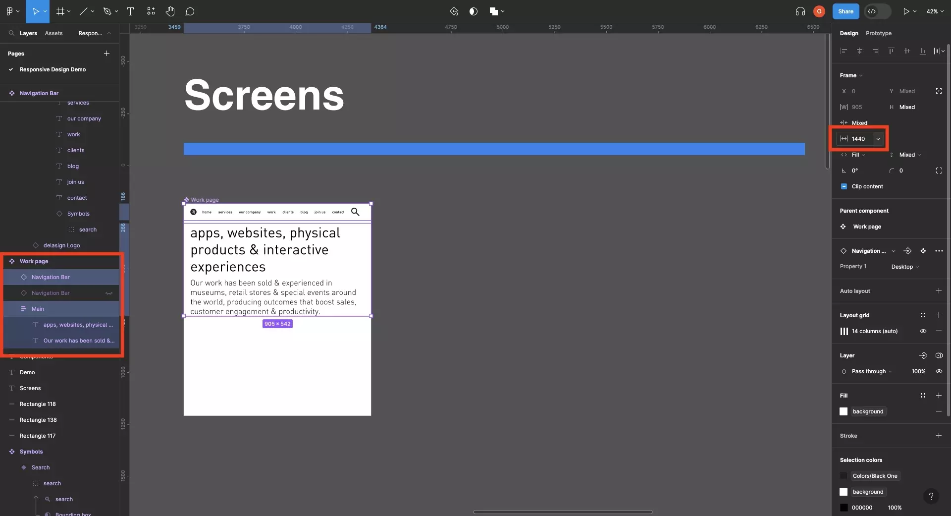
Select all the UI elements within the frame and set the maximum width.

Please note that if the frame's width is larger than this maximum width, the frame will add white space to the sides of the UI elements - this is what "margin auto" refers to.
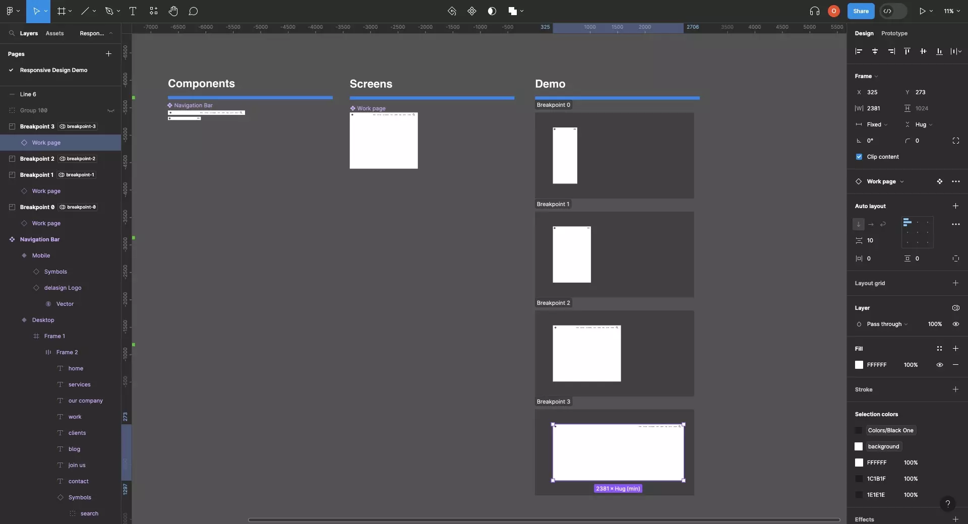
Step Three: Test

A screenshot of Figma that shows 4 sections for the four breakpoint in our design system. Each section shows a different design that matches the intended layout. At the bottom, in the largest version of the design we see that after a certain point the screen applies white space around the edges, fulfilling the intention of this tutorial.

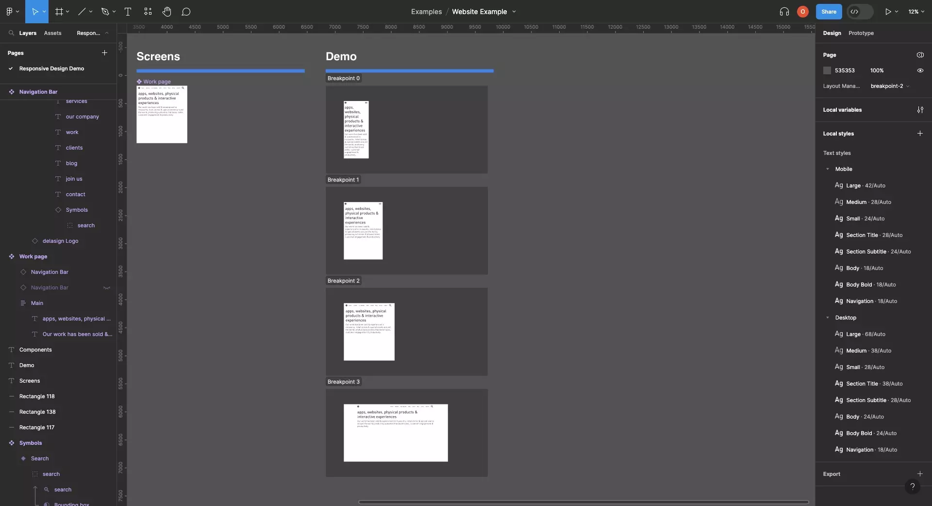
Either using sections or by dragging the edges of the screen, confirm that the design works as expected.

Frequently Asked Questions (FAQ)

How did you create a responsive navigation bar ?

A screenshot of Figma that highlights how you can stretch the work page component between the minimum and maximum width of the breakpoint by dragging the edges around the component.

Follow the tutorial below to learn how.

How can I create a design system ?

A screenshot of Figma showing Styleguide, Typography and Assets next to a variable window that shows that the project has a design system. To learn how to create one, follow the tutorial in the link below.

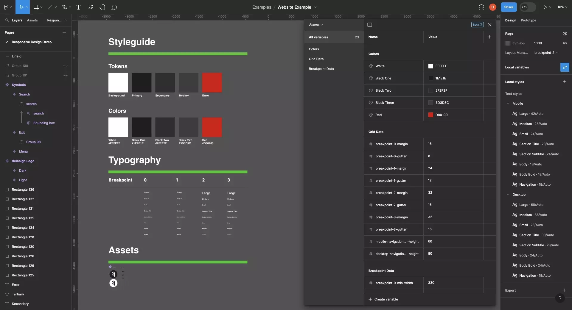
Follow the tutorial below to learn how to create a variable driven design system.

Please note that typography doesn't yet work with variables and so you will have to create styles for each breakpoint.

How do I create responsive layouts ?

A screenshot of Figma highlighting that a frame that has two identical layouts with varying typographic styling. The layouts are applying text variables to ensure consistency across the text.

To learn how to create responsive layouts follow the tutorial below.

How do I create responsive typography ?

A screenshot of Figma that shows 4 sections for each of the 4 breakpoints of our design system. Each section is configured to the variables of a different breakpoint and Figma shows how the layout changes and the type adapts across the breakpoints.

To learn how to create responsive typography follow the tutorial below.

Looking to learn more about Figma and Responsive Design ?

We recommend you check out our Responsive Design Figma Guide or search our blog to find educational content on learning how to use Figma.

Any Questions?

We are actively looking for feedback on how to improve this resource. Please send us a note to inquiries@delasign.com with any thoughts or feedback you may have.
delasign logo

Book a Free Consultation.

An icon of an email.

Click here to email us.

Fill in the details below to book a free consultation or to let us know about something else. Whatever it is, we are here to help.

How can we help you ?

Contact Details