Responsive Design Figma Guide (2023)
A guide that provides naming conventions and references to content that will aid you in the understanding and creation of responsive designs in Figma.

A guide that provides naming conventions and references to content that will aid you in the understanding and creation of responsive designs in Figma.
SubscribeThe following guide provides links to documentation that enables you to understand and learn how to create responsive designs in Figma.
Terminology
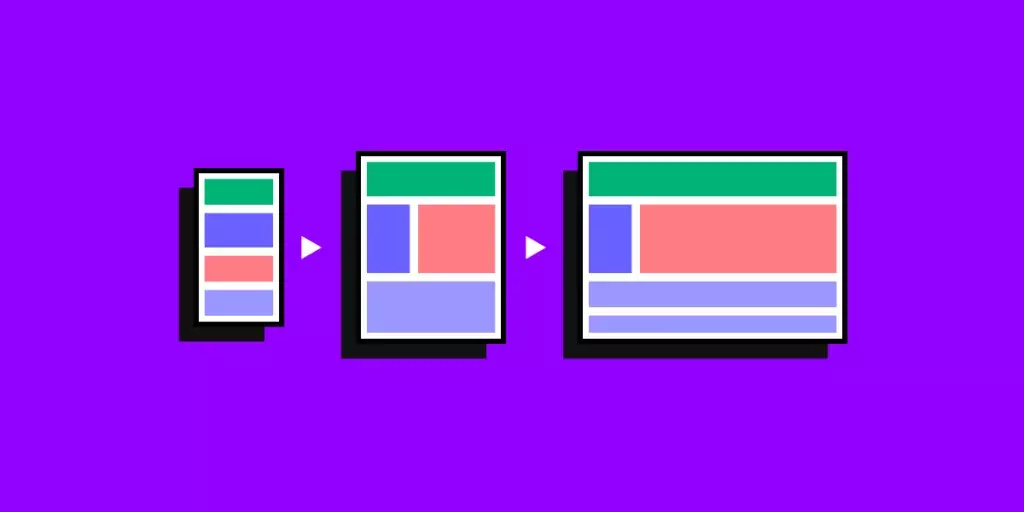
What is Responsive Design ?
Responsive design refers to the creation of digital interfaces, such as mobile apps and websites, that adapt their layout as the interface changes breakpoint or orientation with the purpose of ensuring usability.
What are Layouts?
A layout is an arrangement of visual elements, such as text, images, shapes or buttons, on printed media, a website page or an app screen.
What is Auto Layout ?
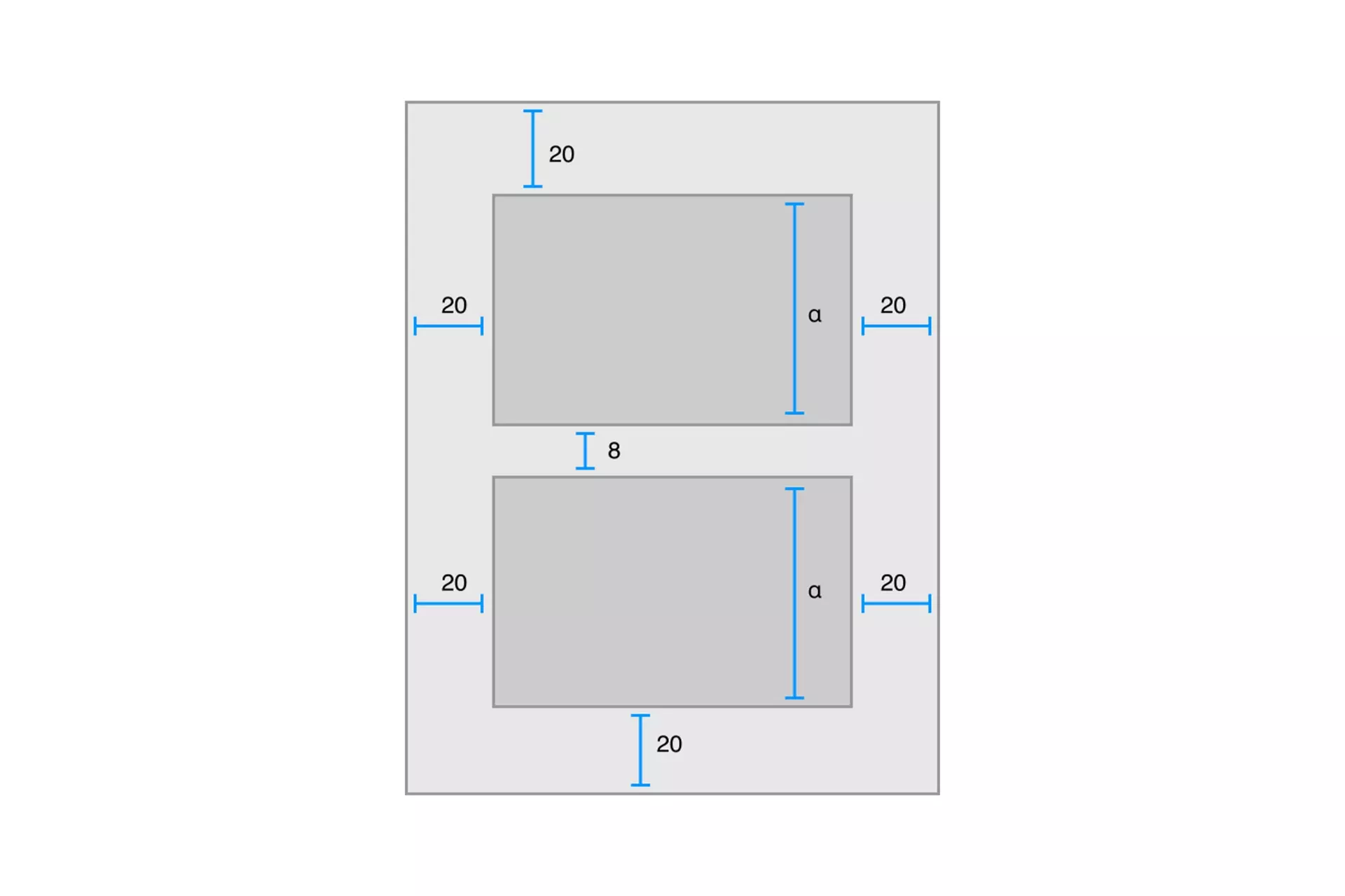
Auto layout is a design technology that uses a constrained-based approach to dynamically adapt UI elements as the size and position of a view, screen or frame changes.
What are Breakpoints?
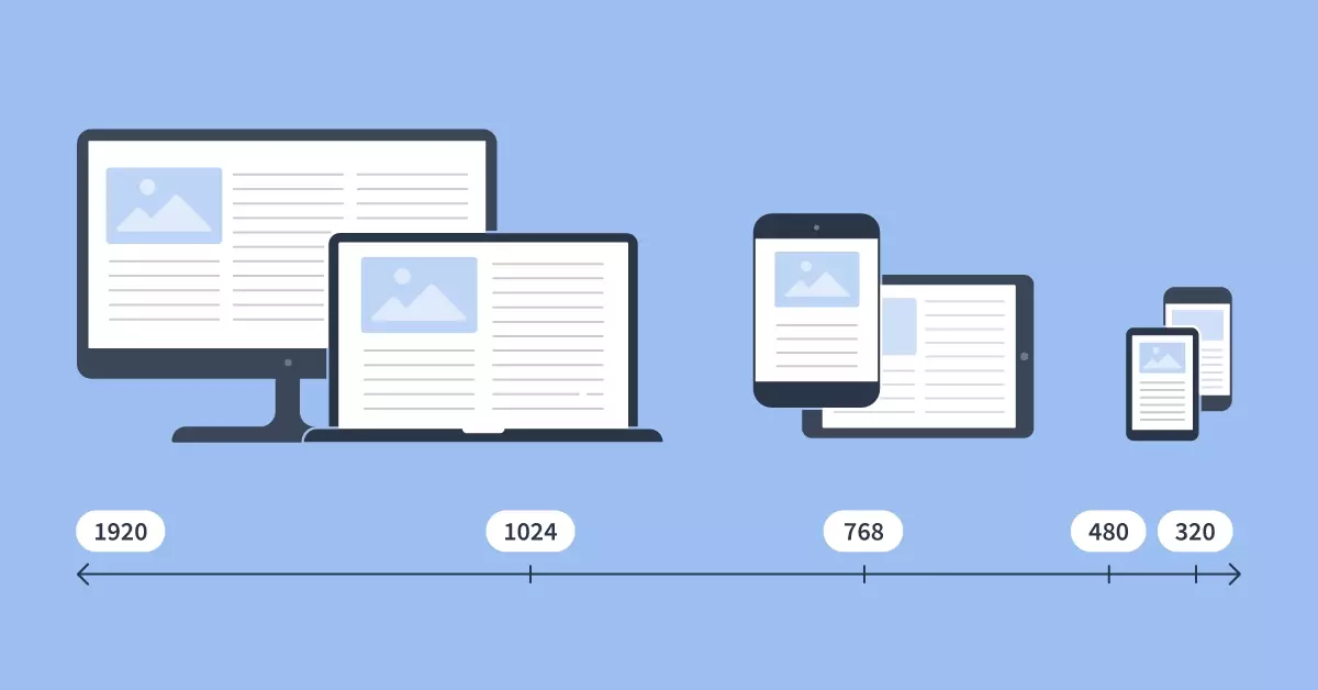
A range of points that determine when a website or app should change layout.
What is a Design System ?
A design system is a collection of reusable components and elements, such as materials, typography, logos or colors, that serve as the backbone behind the creation and promotion of a physical or digital product.
The most well-known digital design system methodology is known as Atomic Design.
What are Variables ?
"Variables in Figma design store reusable values that can be applied to all kinds of design properties and prototyping actions. They help save time and effort when building designs, managing design systems, and creating complex prototyping flows."
Learn how to create Responsive Designs in Figma
Learn the Basics
Follow our tutorials below to learn the basics behind creating responsive designs.
Looking to learn more about things you can do with Figma ?
Search our blog to find educational content on learning how to use Figma.