How to create and use Light & Dark Mode in an App or Website design
A step by step guide on creating a design system that uses light and dark mode, applying it to a design and displaying it in Figma.

A step by step guide on creating a design system that uses light and dark mode, applying it to a design and displaying it in Figma.
SubscribePlease note this feature builds on our design system tutorial and is only available on education, professional or organization Figma accounts.
Step One: Create a Design System that uses Light and Dark Mode

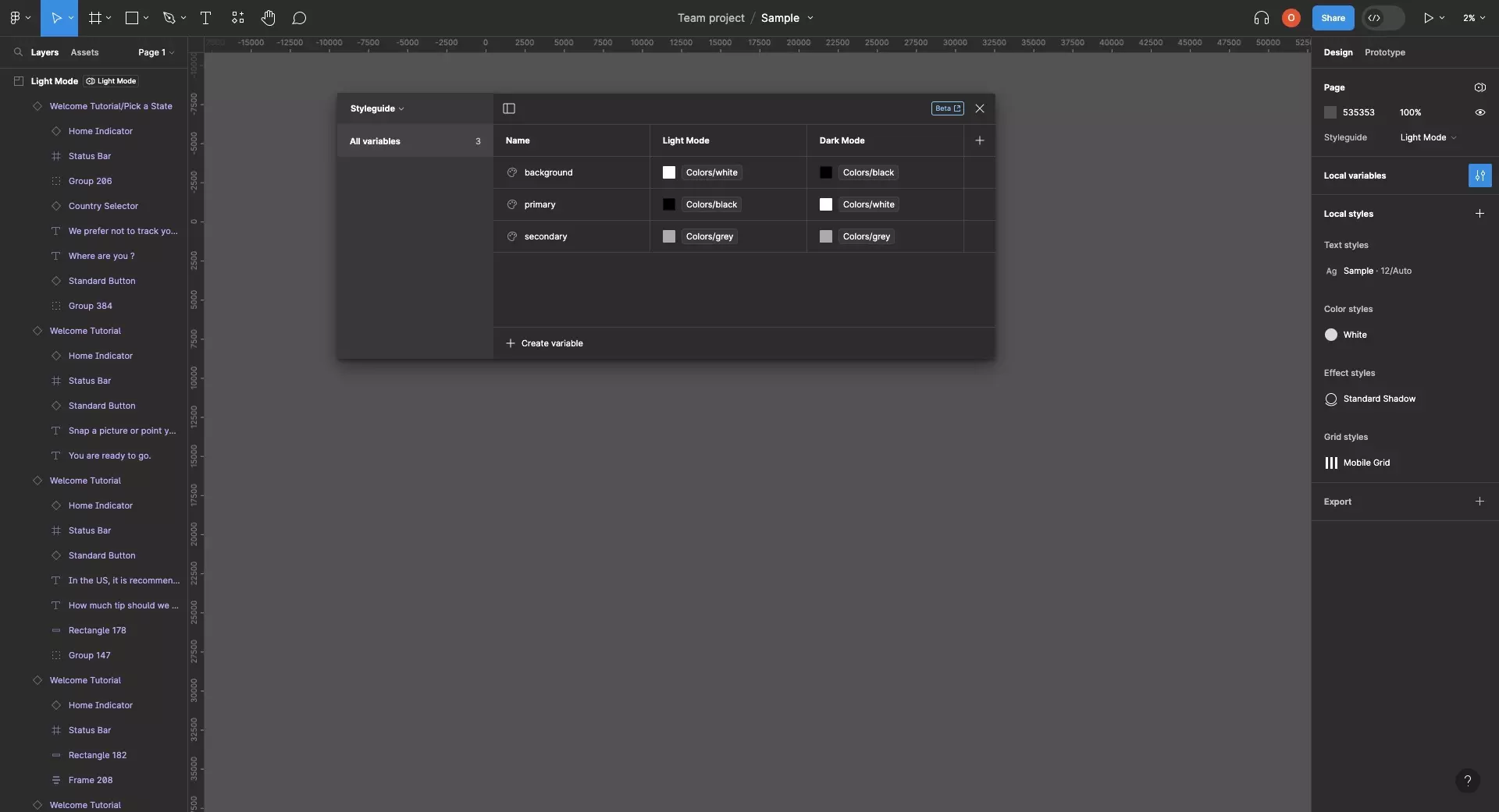
Follow the tutorial below to create a Design System that includes Atoms, a Styleguide and a Layout manager.
Make sure that you create two modes, one for light mode and one for dark mode, and that use Tokens for each color.
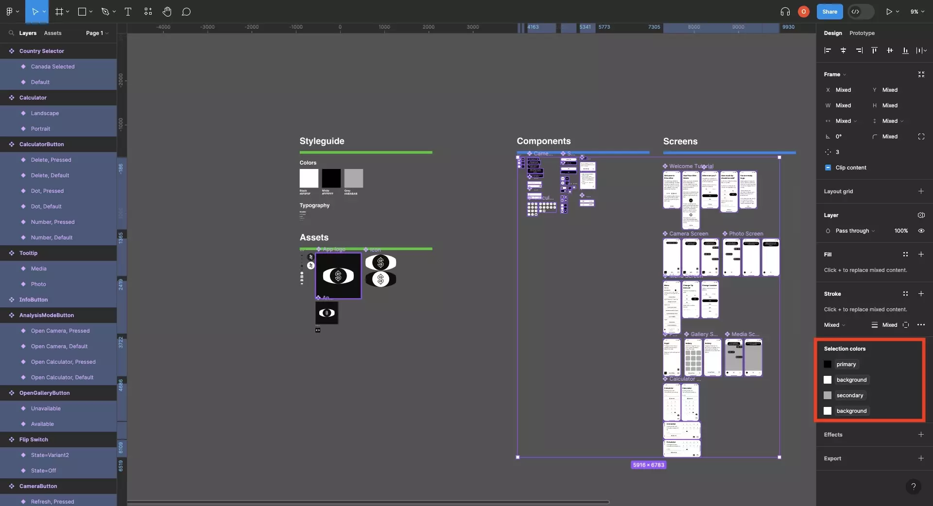
Step Two: Apply the Color Tokens

Apply the color tokens linked to the light mode and dark mode from the Styleguide across your app and websites design.
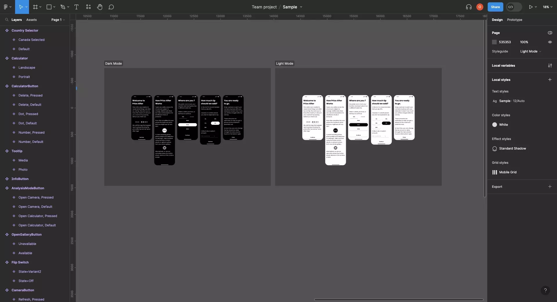
Step Three: Display the Designs

See the designs in light mode and dark mode by either:
- Setting the default Styleguide mode for an entire page within a design file to Light Mode or Dark Mode
- Creating sections for Light Mode or Dark Mode, and setting each section to the relevant mode
Looking to learn more about things you can do with Variables or Figma ?
We recommend you check out our Figma Variables Guide or search our blog to find educational content on learning how to use Figma.