How to use auto layout in Figma
Auto layout is activated by selecting a frame and using Shift + A & is the equivalent of a flexbox in CSS, UIStackView in Swift or a Linear Layout in Android which allows responsive elements within a container to be automatically arranged depending on viewport size.

Auto layout is activated by selecting a frame and using Shift + A & is the equivalent of a flexbox in CSS, UIStackView in Swift or a Linear Layout in Android which allows responsive elements within a container to be automatically arranged depending on viewport size.
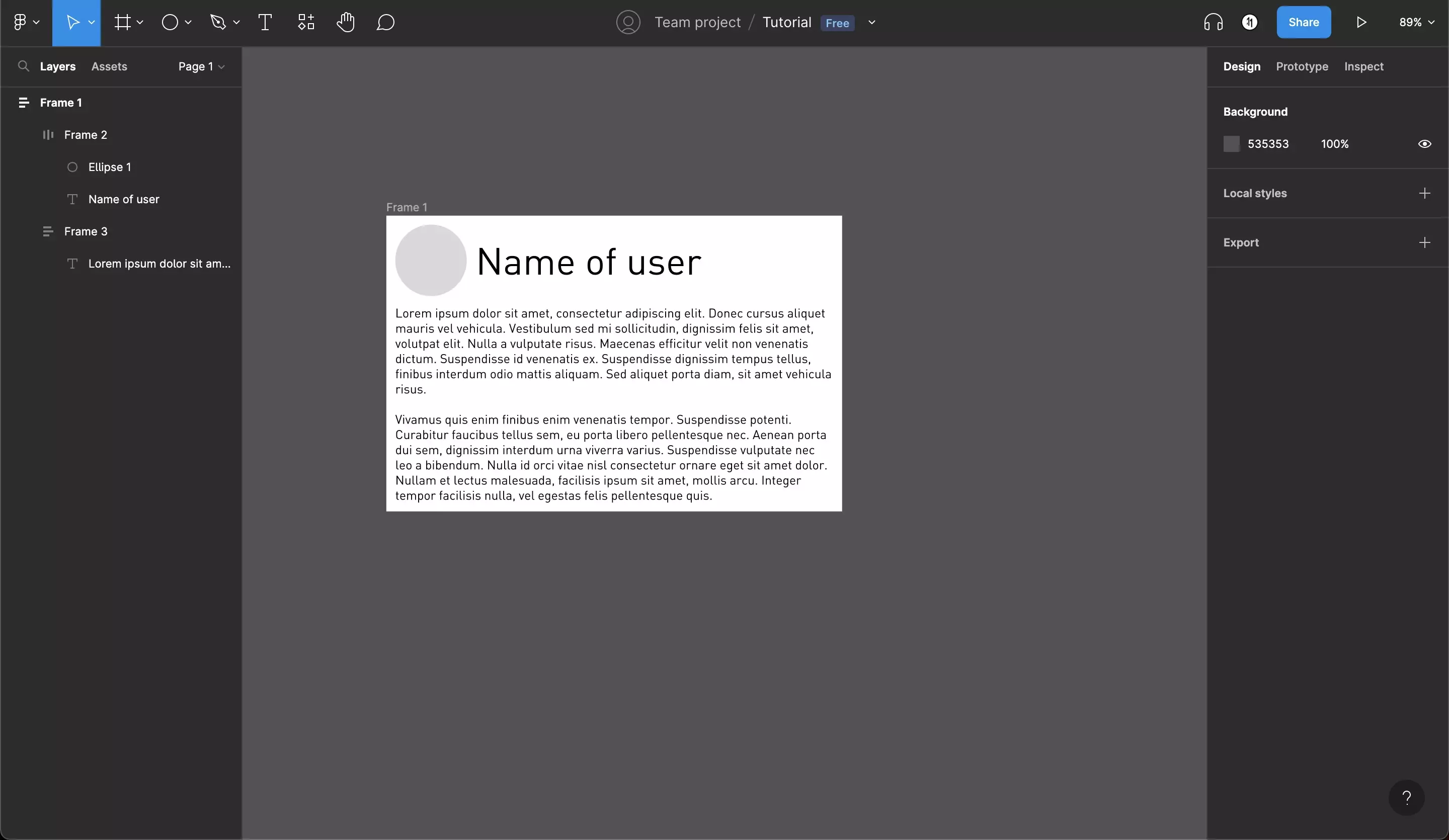
The following guide walks you through the terms that Figma uses for auto layout, their properties as well as a walkthrough on creating sample auto layout in Figma, which is illustrated above.
Terms
There are two terms that are important when creating Auto Layout: Parent & Children.
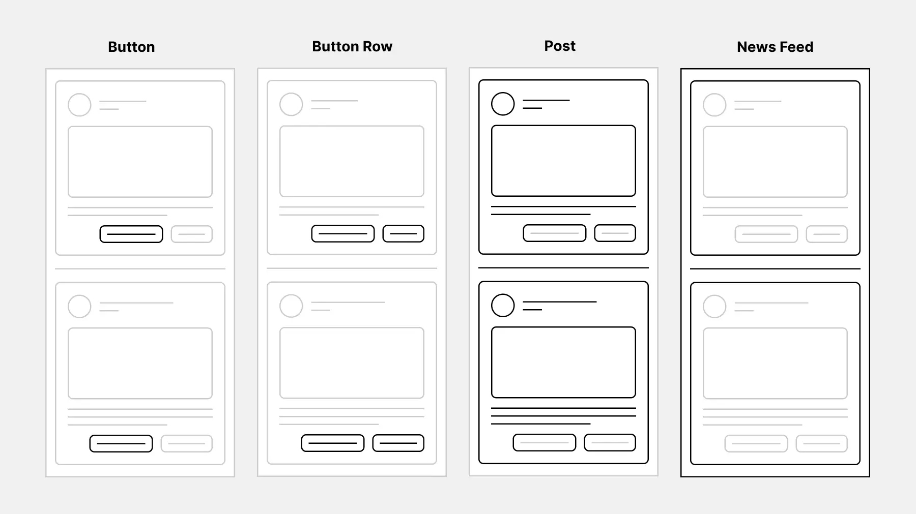
In the image above:
- A Button is a child of a Button Row (parent).
- A Button Row is a child of a Post (parent).
- A Post is a child of a News Feed (parent).
All the parents have auto layouts and can be considered flexible layouts (Flex Box).
Parent
A parent is the frame that contains the elements and objects of your design.
Children
Children are the elements and objects within the auto layout.
Auto Layout Properties
Auto layout properties are available for parent and child components and can be broken down into the following.
Parent Properties
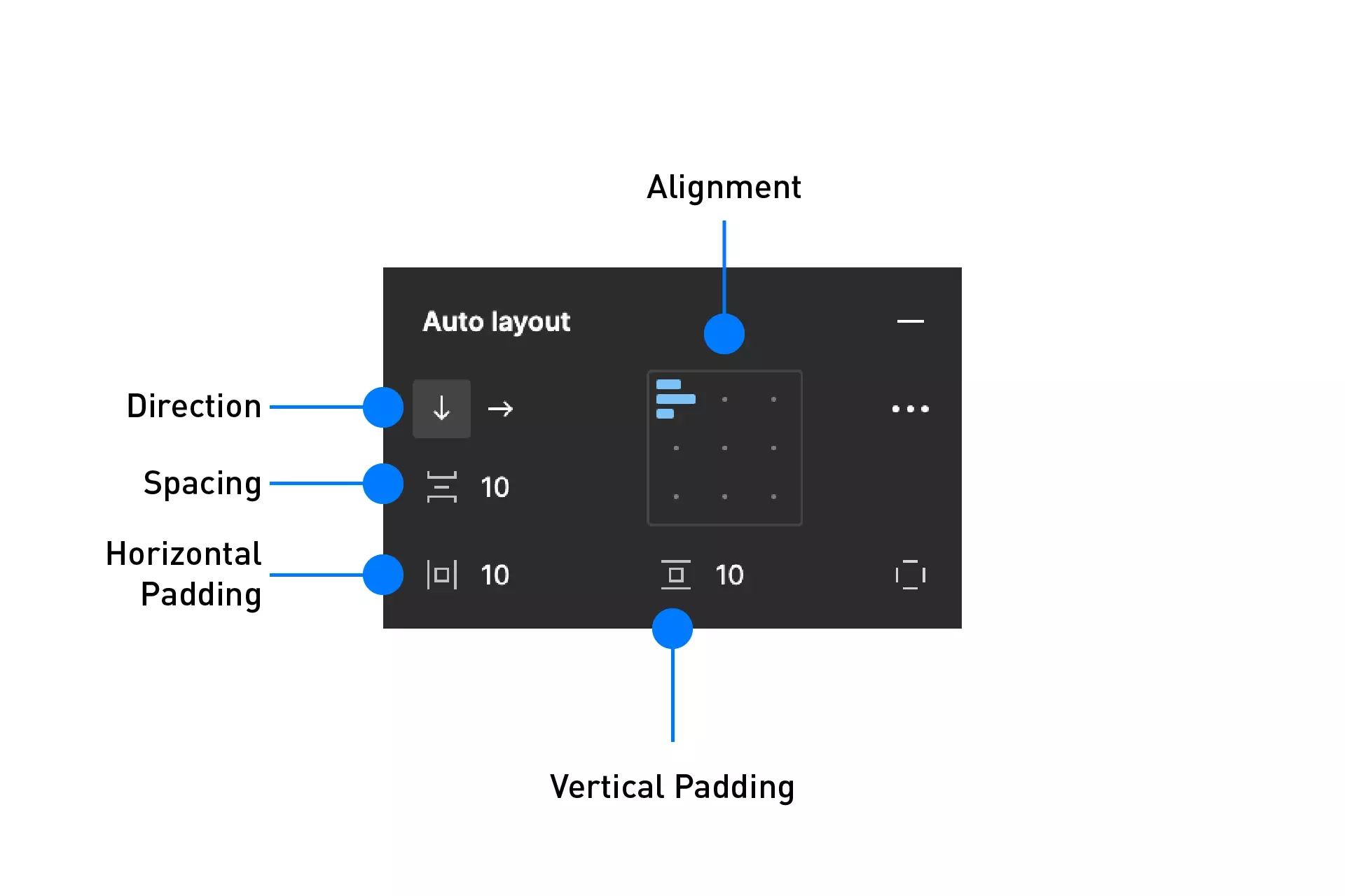
- Direction - allows your design layout either to be in Columns (Horizontal) or Rows (Vertical)
- Padding - determines the whitespace around your objects (Children)
- Spacing - controls the spacing between your objects
- Resizing - Lets you have a dynamic or fixed width
Children Properties
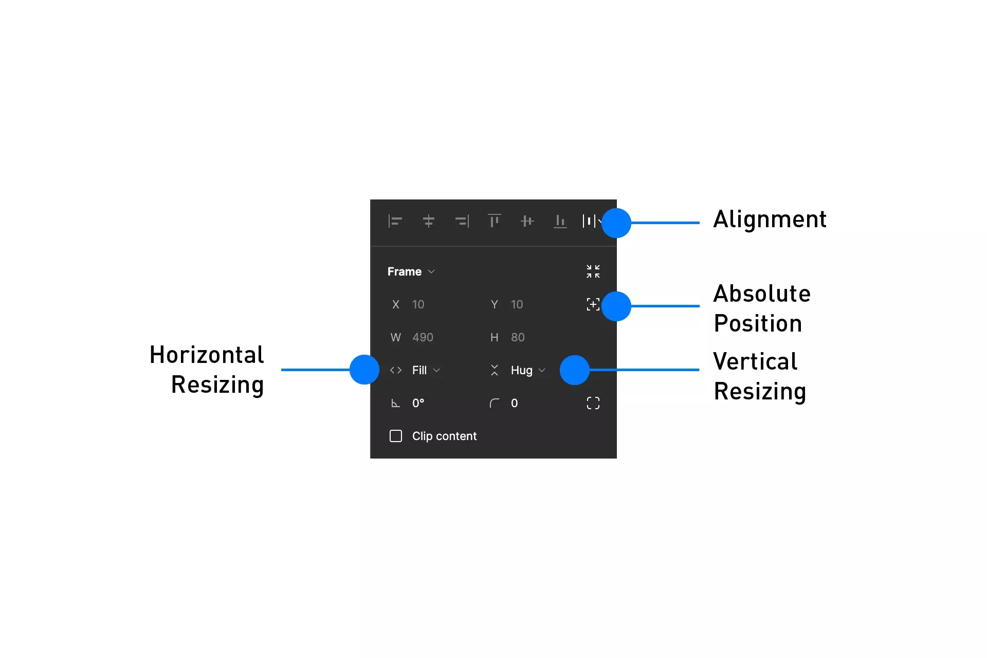
- Alignment - align objects along one axis
- Absolute position - easily position items within auto layout frames using precise controls.
- Resizing - Lets you have a dynamic or fixed width
Tutorial
Step One: Draw a frame
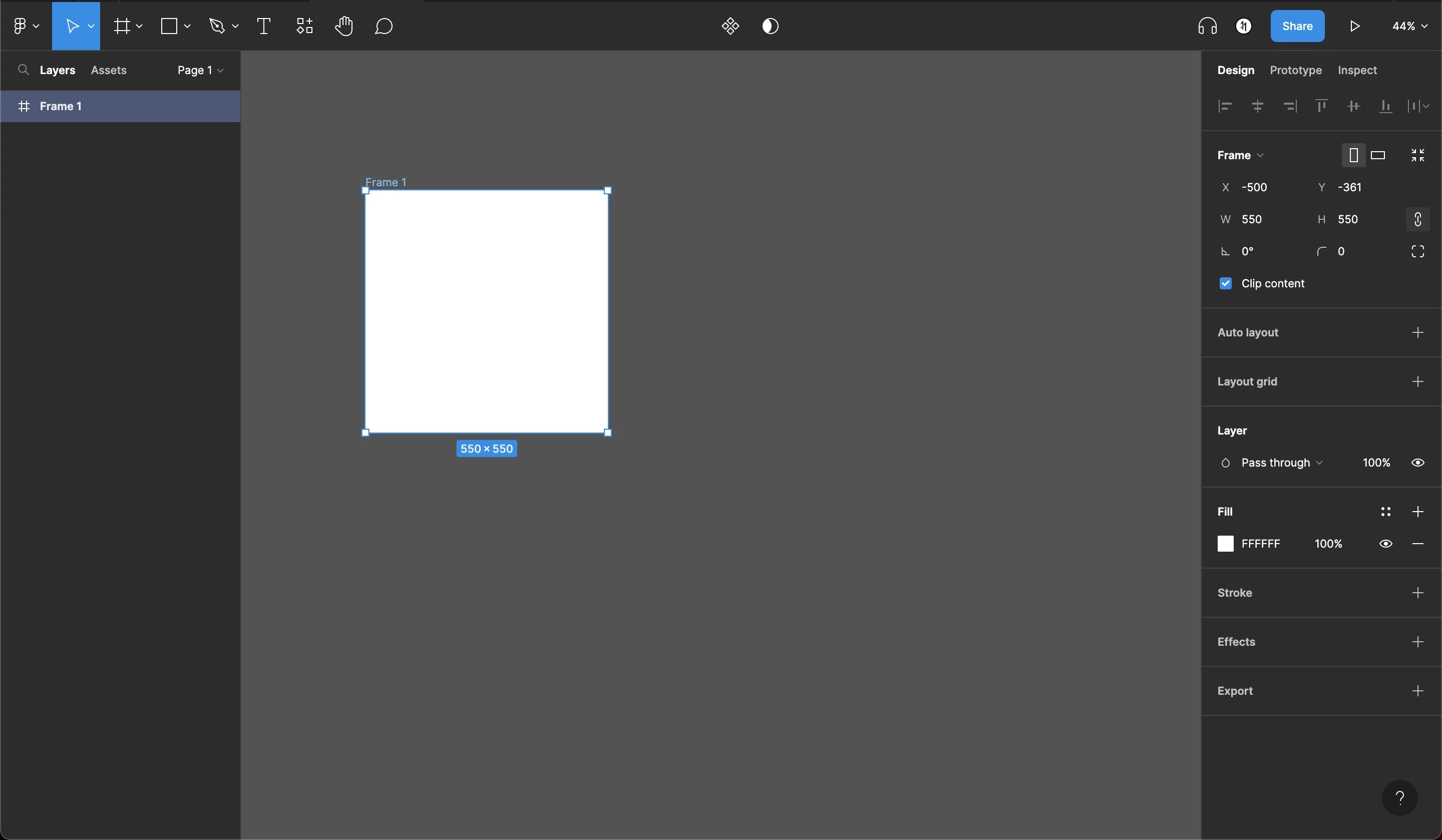
In Figma, open up a project and draw a frame.
Step Two: Convert to Auto Layout
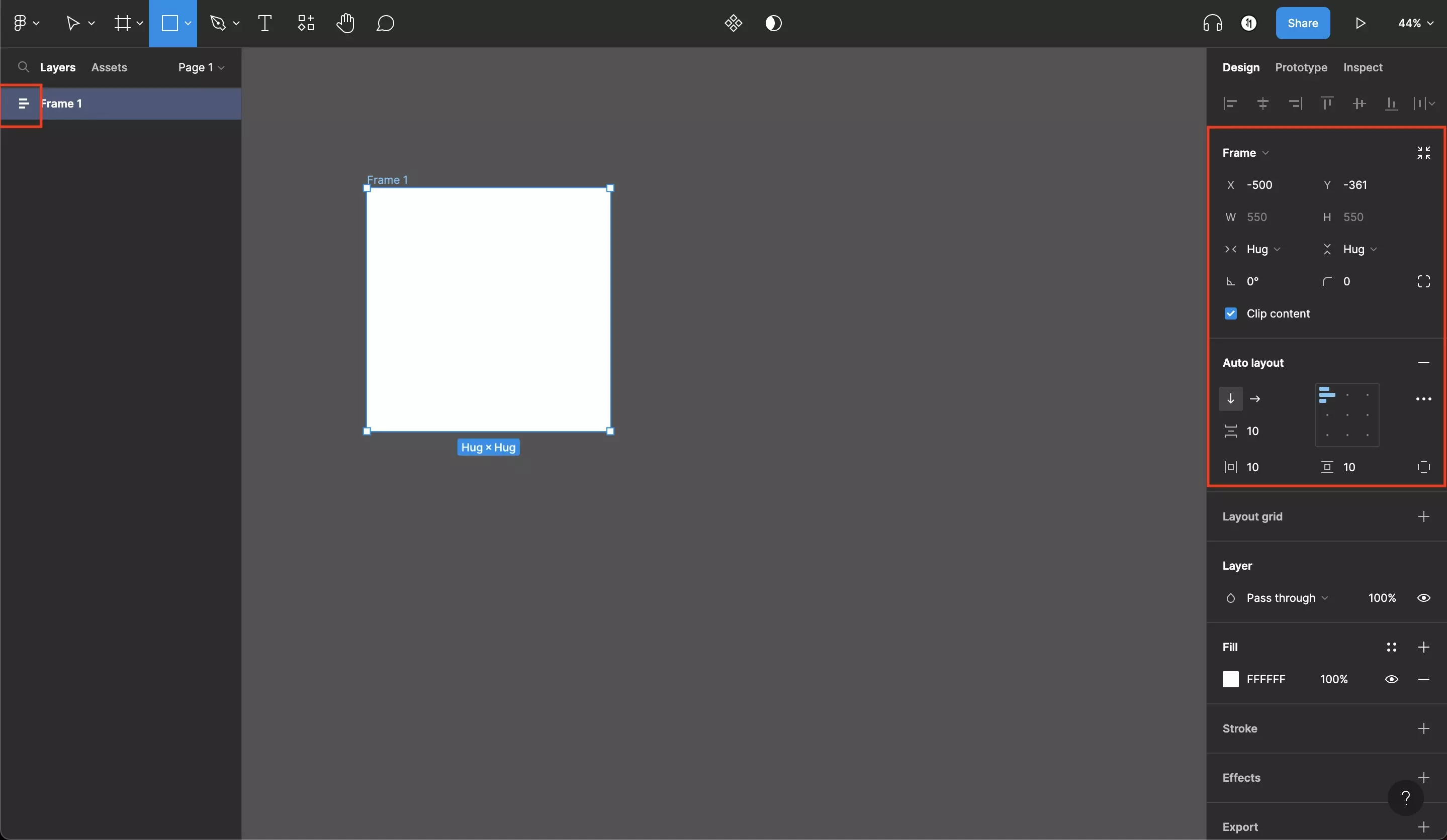
Select the newly drawn frame and press Shift + A.
Alternatively, to activate auto layout:
- In the right sidebar, click next to Auto layout with a frame selected.
- Right-click on a frame or object and select Add Auto layout.
Step Three: Create initial layout
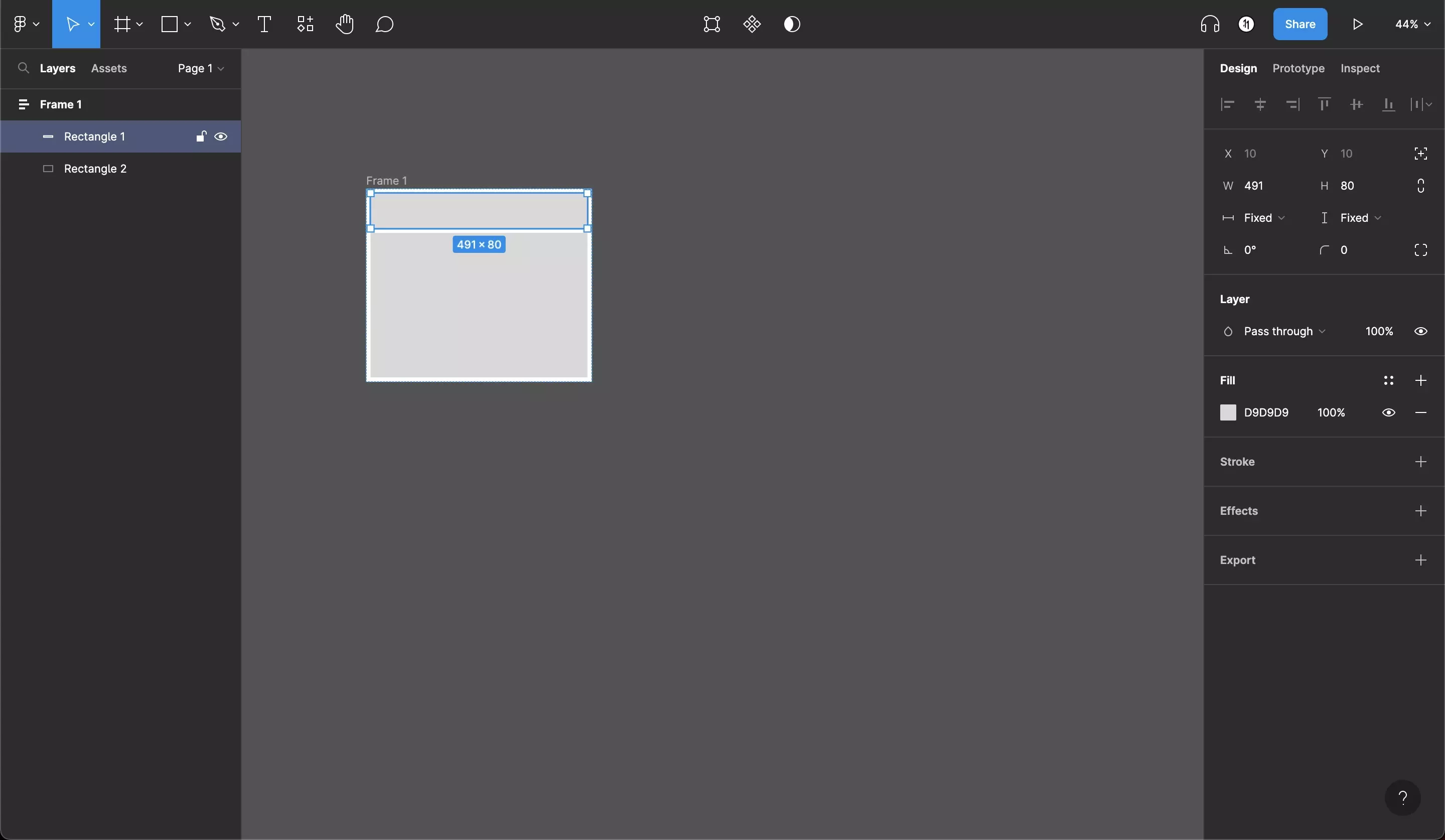
Within the auto-layout frame, draw two rectangles.
Step Four: Setup the top section auto layout
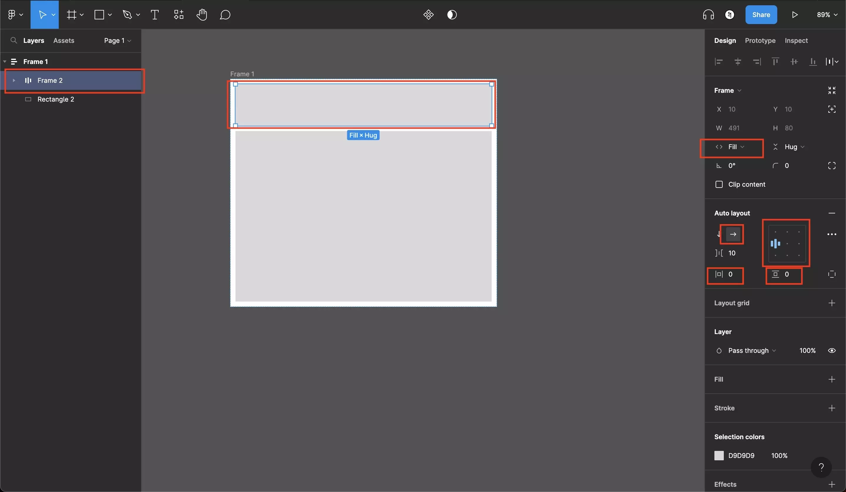
Select the top rectangle, press Shift + A and subsequently modify the settings on the inspector to:
- Make the width off the child fill its parent.
- Have a horizontal layout
- Be left aligned
- Have 0 horizontal and vertical padding.
Step Five: Complete top section layout
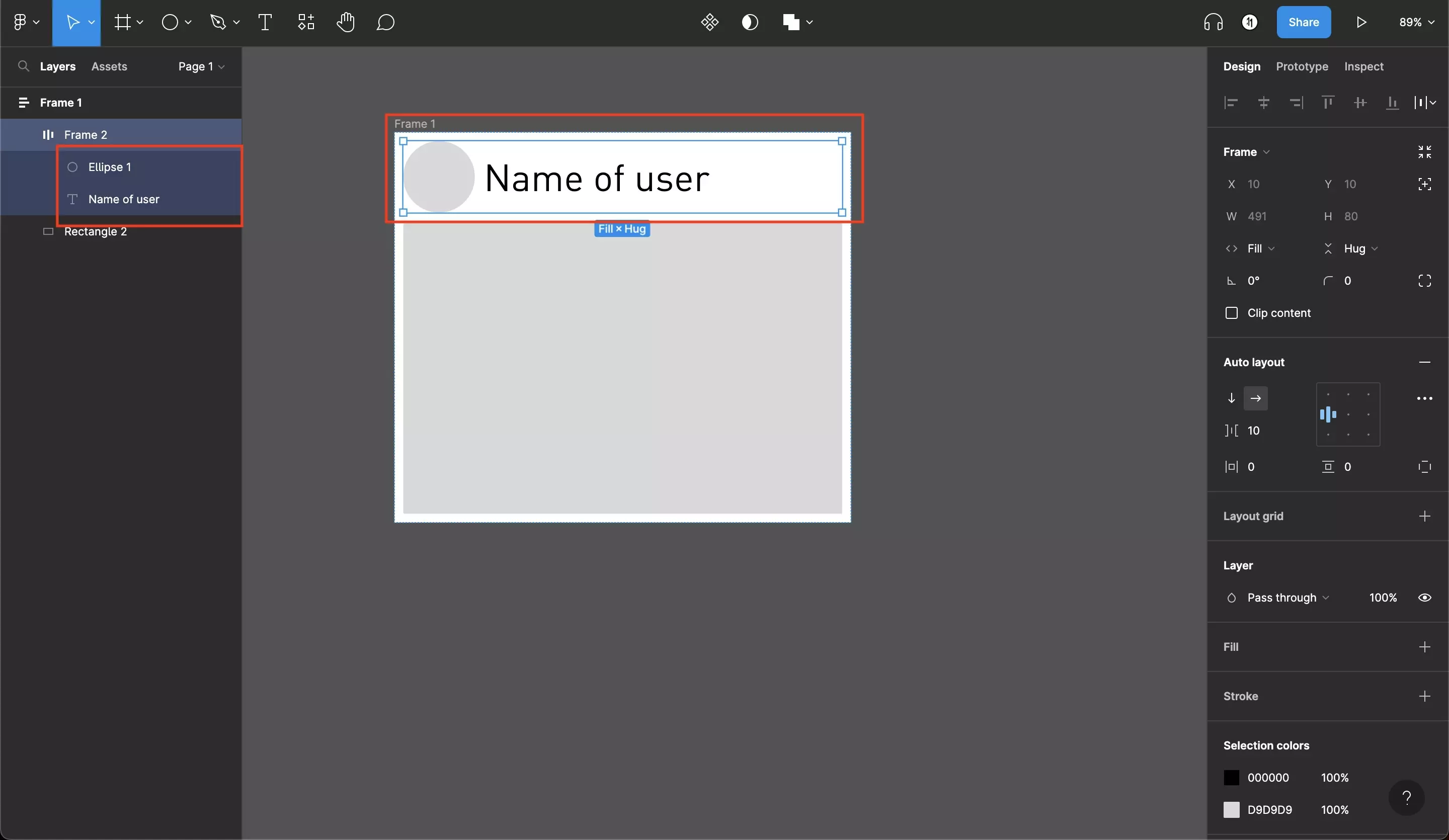
Within the top rectangle complete the layout by adding an ellipse and a piece of text.
Step Six: Setup the bottom section auto layout
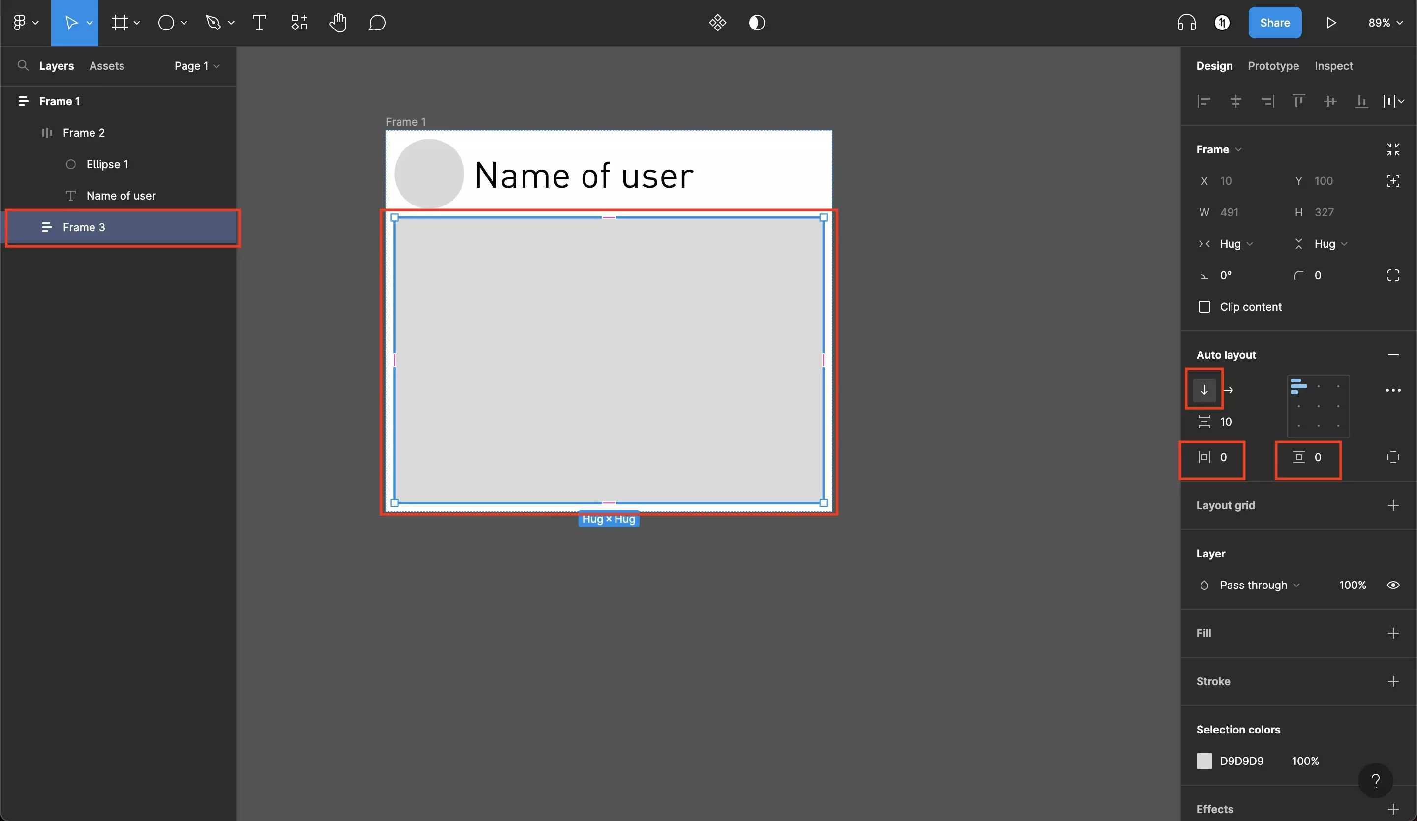
Select the bottom rectangle that you drew in Step Three and press Shift + A. Subsquently, modify the settings in the inspector to have:
- A vertical layout
- 0 vertical & 0 horizontal padding
Step Seven: Complete bottom section layout
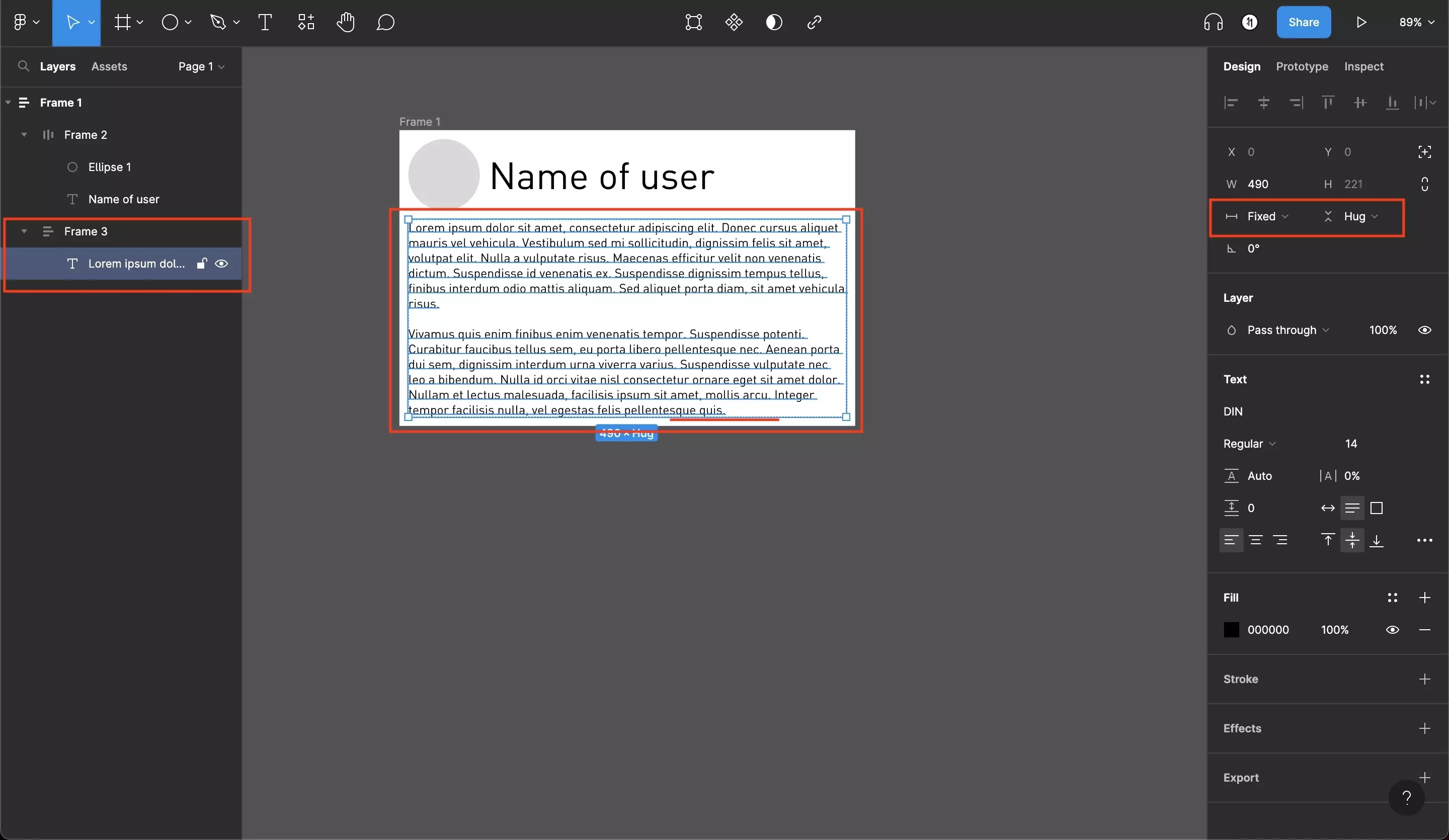
Complete the bottom section layout by adding a piece of text.
Make sure that this child is width is fixed and the height is hug which means that it grows to fill the space needed.
How do I use absolute position within an Auto Layout ?
To learn how to create UI elements that have an absolute position within an auto layout frame, consult the tutorial below.
Any Questions ?
We are actively looking for feedback on how to improve this resource. Please send us a note to inquiries@delasign.com with any thoughts or feedback you may have.