How to create a Component that maintains their Aspect Ratio in Figma

Oscar de la Hera Gomez
A flower that represents Figma with the text "Aspect Ratio in a Component" beneath it.

A step by step guide on creating a component that maintains the proportion between its width and height as it scales.

Step One: Copy the Aspect Ratio Variant

A screenshot of the Fixed aspect ratio in Figma Auto Layout Figma Community file. The components page is selected and we have selected the 4:3 aspect ratio Fixed-aspect-ratio-spacer component variant.

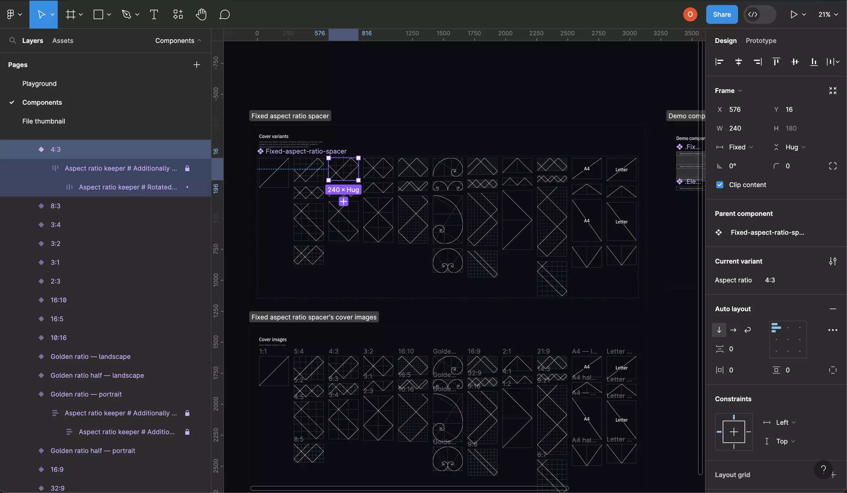
Visit the Fixed Aspect Ratio in Auto Layout community page and open the project.

In the Components page, copy the relevant aspect ratio variant within the the Fixed-aspect-ratio-spacer component.

Step Two: Create the Component

A screenshot of a Figma design file showing a component with two variants. The component variant contains one text UI element and one fixed-aspect-ratio-spacer component variant. Highlighted on the left menu side bar is that there are two variants and that we have selected the frame of the mobile variant. On the left menu side bar we have highlighted that we have set the minimum width to 330px, that the component uses an auto layout and that the horizontal and vertical resizing is set to hug.

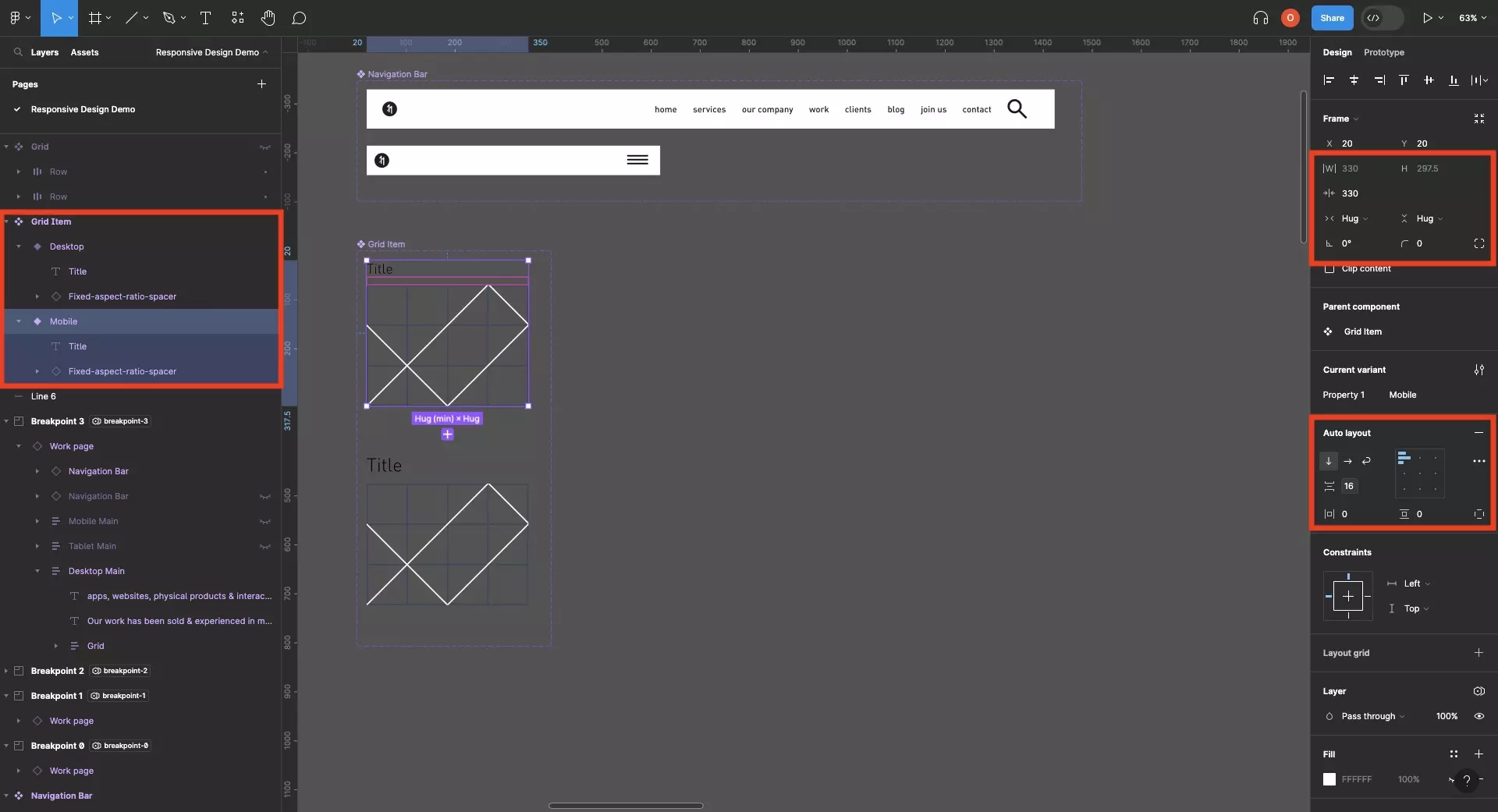
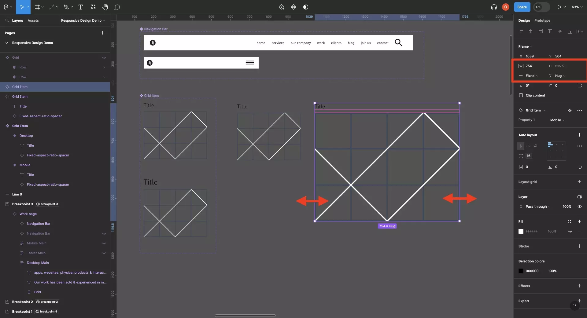
In your Figma design file, create a new component (and variants) that use auto layout and which include the variant of the Fixed-aspect-ratio-spacer component variant.

Make sure that the components horizontal and vertical resizing are set to hug, and include a minimum width to make sure that the visual maintains some level of consistency.

A screenshot of a Figma design file showing a component with two variants. The component variant contains one text UI element and one fixed-aspect-ratio-spacer component variant. Highlighted on the left menu side bar is that we have selected the text ui element and fixed-aspect-ratio-spacer component variant. On the left menu side bar we have highlighted that both components uses an auto layout and that the horizontal  resizing is set to fill whilst the vertical resizing is set to hug.

Make sure all the children within the component, including the Fixed-aspect-ratio-spacer component variant, use auto layout with the horizontal resizing set to Fill and the vertical resizing set to Hug.

Step Three: Resize

A screenshot of Figma showing that we have created two copies of the component. Each has different sizes and the aspect ratio has been maintained. We have highlighted that in order for the component to do this you must either drag the lateral handles or resize the component and set the vertical resizing to hug.

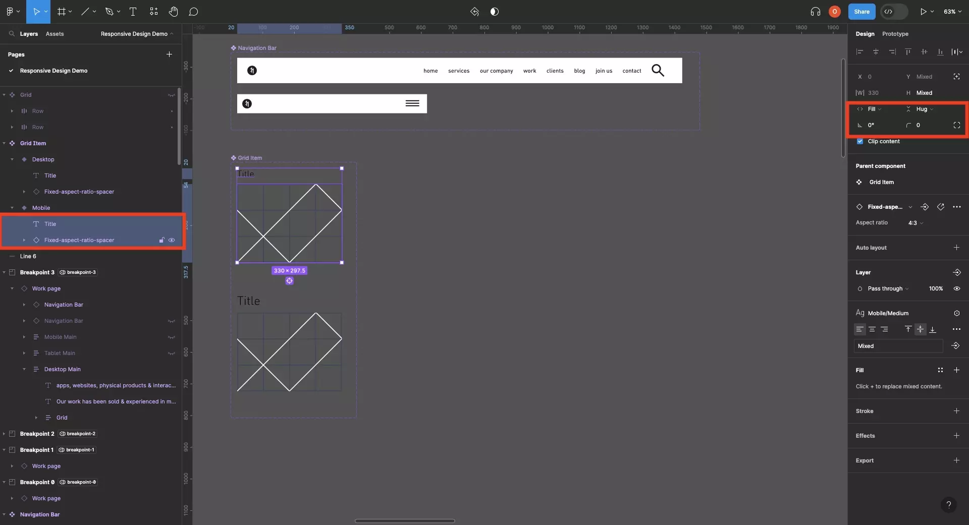
Make a copy of the component and resize it using the handles on the sides.

If you use the corners, make sure you set the vertical resizing to Hug to guarantee that the component maintains a height that correctly renders the children.

Frequently Asked Questions (FAQ)

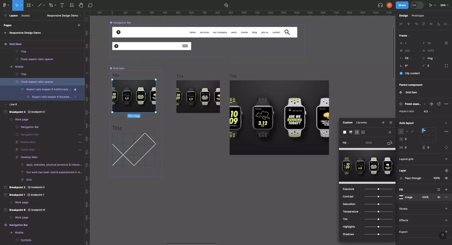
How do I change the image of the Fixed-aspect-ratio-spacer component variant to an Image or a Video ?

A screenshot of Figma with a component that maintains the aspect ratio selected. We have highlighted that if you press the square under fill with a component selected a window will appear where you can change the image of the component by clicking change image. This window will also allow you to set a video.

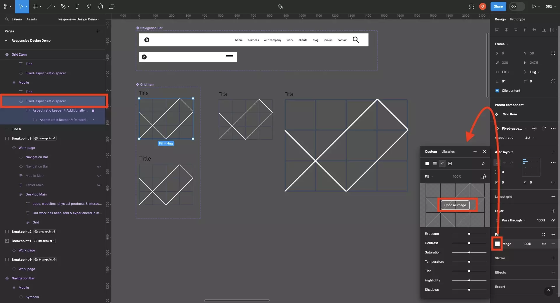
Select the element and under fill, click the square.

In the window that appears, click choose image.

A file browser window will appear that will allow you to pick an image to apply to the Fixed-aspect-ratio-spacer component variant.

A screenshot of Figma showing that the component has been updated to use the image of our Apple Watch Nike+ project.

How do I change the typography depending on the size of the component ?

A screenshot of Figma that shows 4 sections for each of the 4 breakpoints of our design system. Each section is configured to the variables of a different breakpoint and Figma shows how the layout changes and the type adapts across the breakpoints.

Consult the guide below to learn how to create designs that adapt the typography as the screen or component changes size.

Looking to learn more about Figma and Responsive Design ?

We recommend you check out our Responsive Design Figma Guide or search our blog to find educational content on learning how to use Figma.

Any Questions?

We are actively looking for feedback on how to improve this resource. Please send us a note to inquiries@delasign.com with any thoughts or feedback you may have.
delasign logo

Book a Free Consultation.

An icon of an email.

Click here to email us.

Fill in the details below to book a free consultation or to let us know about something else. Whatever it is, we are here to help.

How can we help you ?

Contact Details