How to create a composable that sizes to fit using Kotlin
A step by step guide on creating a Jetpack Compose Composable that dynamically adapts its width & height to fit its content via a ConstraintLayout using Kotlin.

A step by step guide on creating a Jetpack Compose Composable that dynamically adapts its width & height to fit its content via a ConstraintLayout using Kotlin.
SubscribeDownload Open Source Kotlin Starter ProjectThe following tutorial builds on our Open Source Kotlin project which can be downloaded using the link below, and aims to walk you through how to create a Composable that dynamically adapts to fit its content.
The composable that we create is very similar to the tooltip that we use in Price After.
We recommend that you checkout the main branch and carry out the steps described below. The changes that took place can be found on the tutorial/jetpack-compose/size-to-fit
git clone git@github.com:delasign/kotlin-android-starter-project.gitStep One: Add the Content
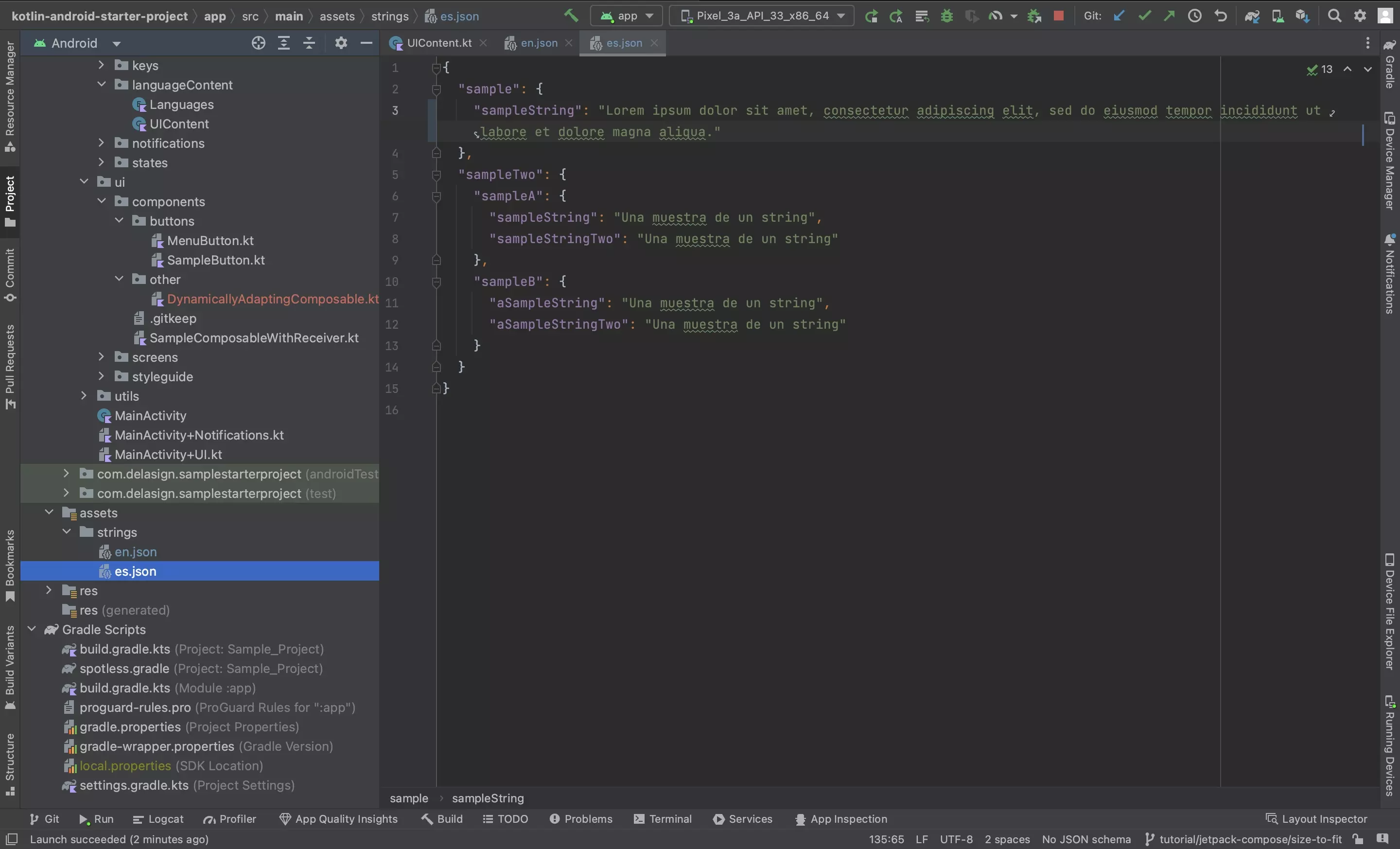
Follow the tutorials below to add the relevant localizable strings, symbols or images to your Android project.
Step Two: Create the Composable
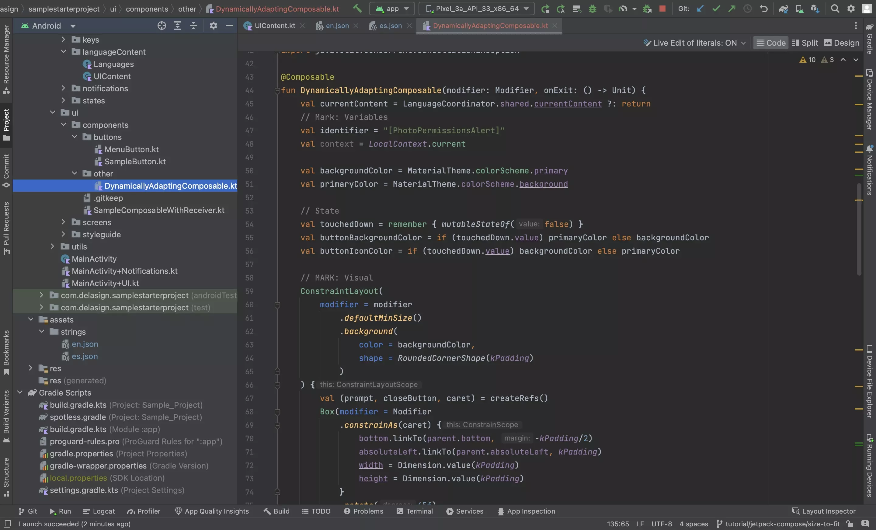
In the project, create a Composable that uses a ConstraintLayout.
This is the file that intends to use auto-layout to dynamically adapt to its content.
For this to work as desired, the elements within the Composable must touch the top, absoluteLeft, absoluteRight and bottom of the parent.
Please consult the code below if you wish to see how we created the composable. The LabelText was created as part of our Styleguide tutorial.
Step Three: Place the Composable
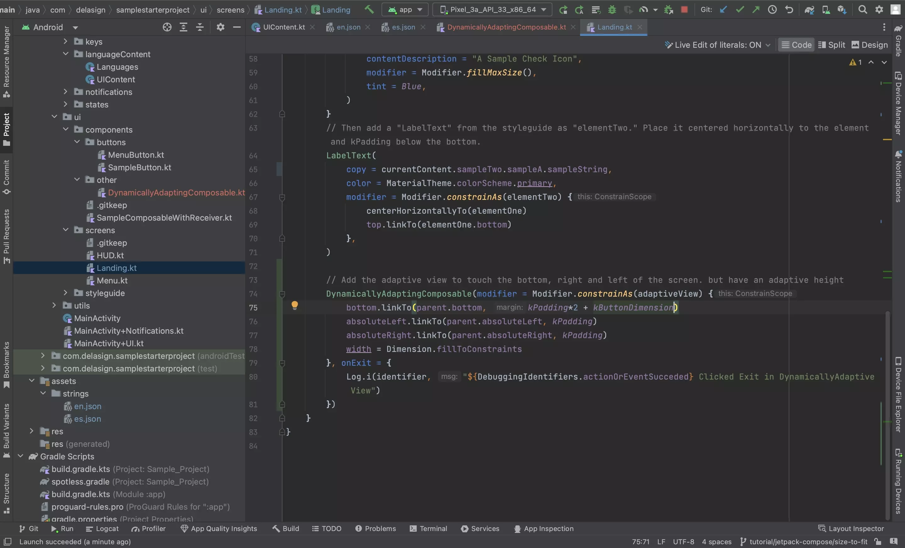
Add the composable to the app.
Step Four: Test
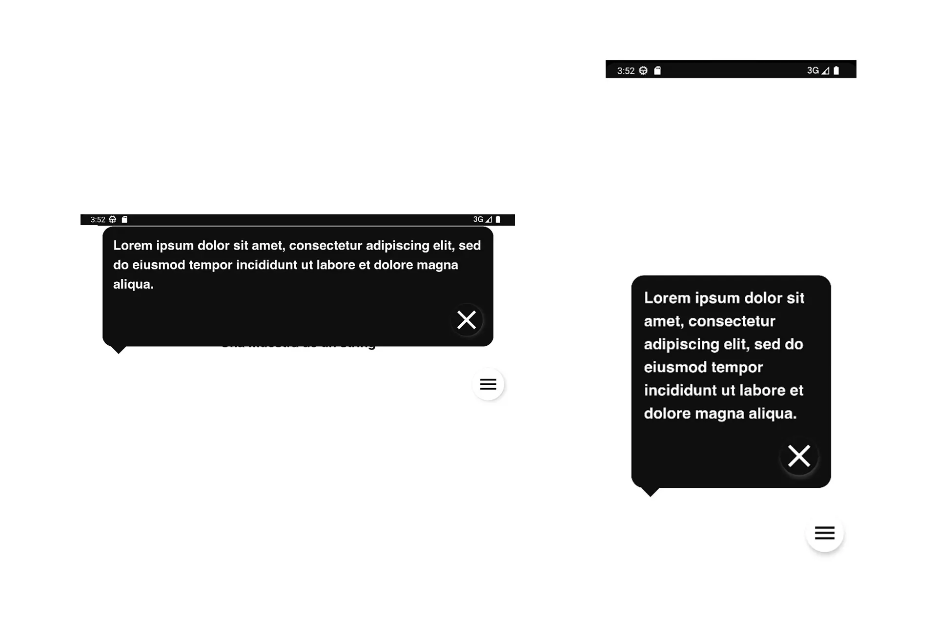
Run the code and you will see that the composable adapts to fit the content based on the constraints.
In the example above, it has a different height (which is calculated dynamically) in landscape and portrait as the width is different on those two views.
If you wish to learn how to maintain states when the app changes orientation (i.e. goes from portrait to landscape or vice versa) follow the tutorial linked below.